Home / Articles / How to determine the series of a house / Series GMS-1 (GMS-2001)
Standard series of houses GMS-1, GMS-2001
When designing new housing, leading construction companies strive to introduce effective technologies into their facilities that could provide the modern consumer with comfort combined with economical consumption of energy resources. A successful example in the field of housing construction is the series of multi-storey buildings GMS - 1. The project was developed in 2003 by order of the Glavmosstroy Insurance Company and has been successfully implemented within the Moscow Region and Moscow to this day.
GMS-1: features of construction and layout of apartments
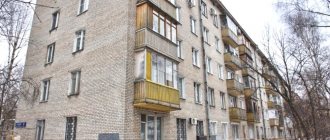
GMS-1 is a new type of panel apartment buildings, which are built from isolated block sections. Buildings of different number of floors and heights are resistant to seismic activity of the earth. They are also protected from destruction that can be caused by partial damage to sections (collapses, domestic explosions). GMS-1 facilities are characterized by excellent thermal protection and sound insulation. At the same time, like other panel-type houses, they are quickly erected. The cost of apartments is low compared to business and elite class.
Together with the new construction method, the general designs of residential buildings of the GMS-1 series include the highest requirements for modern housing by consumers. This:
- spacious rooms with increased area and thoughtful layout;
- paired windows in the rooms providing bright lighting during the day;
- ceilings 3 m high;
- separate sanitary rooms (not adjacent to the partitions of neighboring apartments);
- 2 bathrooms in 2 and 3-room apartments;
- spacious halls;
- freight and passenger elevators in each entrance;
- ramps for people with disabilities;
- auxiliary and utility rooms located on the ground floor: concierge room, stroller room, electrical switchboards, storage sheds for cleaning equipment, etc.;
- fire protection system with smoke-free stairs and balconies;
- mobile waste chutes on sites;
- natural exhaust ventilation system.
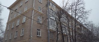
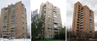
Over the past period, more than 70 houses have been put into operation. Visually they are recognizable by double windows and glazed loggias. However, the façade of the buildings is designed at the request of the customer - faced with brick, panels or cellular concrete blocks. Houses are painted in different colors, among which pastel shades of pink, beige, turquoise and others predominate. This approach allows you to hide the “serial nature” of objects and make them individual in appearance.
In the capital, residential complexes of the GMS-1 series are rising in both new and old microdistricts (Maryinsky Park, South Butovo, Kuntsevo, Perovo, Koptevo, etc.). Within the region, improved type panel houses have been built or are under construction in the cities of Lyubertsy, Krasnogorsk, Podolsk.
Residential buildings of the GMS-1 series are designed in two versions: commercial and municipal. The main difference between them is the square footage of the apartments - in commercial buildings the living area is larger.
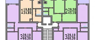
Residential multi-apartment buildings of the GMS-1 series are being built within the range of 9-18 floors. The first floor is allocated for utility and auxiliary premises. The number of entrances in houses is not limited and can be from 1 or more. Each entrance is equipped with passenger and freight elevators with a lifting capacity of 400 and 630 kg, respectively. There are 3-4 apartments on each floor. Most of them have storage rooms, as well as small closed rooms that are used as dressing rooms. The area of residential and non-residential rooms depends on the layout and type of housing. The total square footage of the apartments ranges from 26-84 m2. General average quadrature data is shown in the table below.
The main foundations on which our company is based
- Quality comes first. We always strive to achieve maximum results. Regardless of what class of repairs are being carried out, we always follow technology so that the work we do will please you for many years.
- All the best goes to the client. That's why we provide step-by-step pricing, allowing you to track your costs.
- Do not interfere or bother. Our specialists always work autonomously, you do not depend on them, and they do not depend on you. That is why during the renovation period you can go on vacation or just go about your business without being distracted by workers.
- Honesty and integrity. Before starting construction work, we always determine realistic deadlines and clear costs. In the future, we stick to our promises, do not delay the repair process, and there is no question of incurring additional costs.
Make your choice in favor of LionGroup. We assure you, you won't regret it.
I have a slightly larger room, it turned out like this
I am planning a dressing room like this. The room will have shelves for small items and a chest of drawers. Do you think there is not enough space for the 1st +\- 1?
It’s tempting to divide the nook at the entrance into a wardrobe for outerwear and a dressing room from the room - all the clothes go there.
And then - according to taste and preference. I wouldn’t try to cram both a bed and a sofa into the room - the room is too small for that.
You are right about the room, it is small for zoning. But will it be convenient about the dressing room? I was planning to do something like this.
I did this in my studio. The plan, however, does not indicate a wardrobe at the entrance. but this was exactly the idea - to divide this appendix functionally: a spacious closet at the entrance and a dressing room in the sleeping area.
https://eva.ru/albumpage/226720/638635.htm the first is a general plan (without furniture), the third picture is the door to the dressing room.
I would make a separate bedroom in the hall like this: https://www.ikeahackers.net/2010/10/turn-your-studio-apartment-into-1.html A double bed 1.40 m plus soundproofing will fit exactly. Then the one who is tired can sleep peacefully, and the one who is not yet can do something in the room.
the bed can be made on a raised platform and a wardrobe under it (you can make retractable clothes hangers).
In the future, you can also divide the room into 2, the walk-through room will serve as a living room, and the right side of the plan will serve as a children’s room. 8m2 for the living room just seems like a little, but it can be done if there is a good (folding) table for company in the kitchen, but we don’t accept large groups in the living room. It is important to make the most of the space, i.e. a flat-screen TV on the wall or a cabinet, instead of a table - an ottoman in which you can put things and on top of which you place a tray when, for example, we drink tea in the living room, and so on. You can and should take a folding sofa (in case your mother or other guests arrive).
So some people can’t sleep together at all, she kicks, he snores like a hog. And yet - I had a grandmother, so for her the whole sofa was a single one. Even on the plane, we had to reserve two chairs. So what?
A bed is an individual matter, and it’s not just a matter of size. Likewise, the mattress, for good reason, needs to be selected separately for each person. Because it is not a fact that the mattress that suits a 45-kilogram girl will suit her 90-kilogram husband. But a nuance: the desired does not always correspond to the possible. In this case, we have a one-room apartment and not a country house, and, especially if one of the spouses is a lark and the other is a night owl, it seems to me that it is still worth trying to implement a separate (from the living room) sleeping place. But it’s our job to decide who will live there – to offer different options.
Dear Natalya, I have something like this (1.20 to 1.80) and I’m disappointed with the capacity. It is very impractical to climb into it with a basket of ironed linen - the basket sometimes clings to a dress, sometimes to a jacket. There was more room in a regular closet than in this one. It takes a lot to walk through, a lot of space is wasted at the top, and it’s impractical to put clothes up and climb for them every time. Moreover, one of my friends also did something similar to himself, and he did the same.
I advise you to first try on the capacity if you do; take cardboard boxes and a mop and build shelves and a rod, see how many clothes you can fit. If it suits you, good luck, but to be honest, I regretted it. Although I don’t have an acute problem with floor space yet, so I’m not going to change anything yet, I admit that a separate room for clothes gives a certain mood in the morning. I stuffed it with dry ground coffee in bags, since there is no ventilation in it, the smell when you enter is very noticeable (by the way, the fact that there is no ventilation means that you need to install a chemical dehumidifier). You can’t smell the coffee on your clothes, but last year I dried lavender there (it grows beautifully in a pot at home on a sunny windowsill). Aromatherapy. But all the same, considering how much time I spent adjusting all these shelves to size, sanding (and this was with a machine), painting, sanding again and painting again (I made it from old boards). I could just as easily build a wooden cabinet. It would make more sense.
Tense vector
Project concept:
Creating an open space that combines the hallway, living room and office. The use of natural wood texture is a key solution to maintain a consistent style for all interiors.
The project is designed for a family of two people. Hosts are expected to meet with friends “on neutral ground,” so a large dining room or dining table in the living room is not needed. They often work at home, so they need a work area (preferably even an office). The authors of the project designate a room with a balcony for the bedroom. The central living space is divided approximately in half: an office is placed near the window, and the remaining part is combined with the hallway and turned into a living room-hall. To allow natural light to enter here, a sliding partition from Astor Mobili (Italy) made of frosted glass is installed between this room and the office. To fasten it across the room, a guide is installed under the ceiling.
In the design of the apartment, rare combinations of colors are used for the interior (brown with turquoise and pink), as well as original and inexpensive finishing materials. The main wall covering is paintable wallpaper without a pattern, which allows you to create the effect of plastered and painted walls. In the bedroom and living room, inserts from decorative wallpaper Green Wave (Korea) and Amazone wallpaper (Belgium), wall panels “LightDeco” (Russia), trimmed with zebrawood veneer, are used.
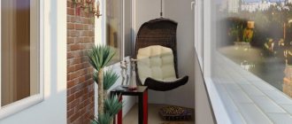
In the kitchen and bedroom, window sill blocks are dismantled, radiators are moved and sliding glass doors leading to the loggia and balcony are installed. The walls and ceilings of the latter are insulated and equipped with heated floors here (as well as in the hallway, kitchen and bathroom). Bathroom and toilet are combined. The new room becomes more spacious, but there is not enough space for a washing machine - it will have to be built into the kitchen. The bathroom is decorated in a fresh and original way - the interior is reminiscent of a yacht or a comfortable bathyscaphe. The ceiling is decorated with panels trimmed with zebrawood veneer. Above the bathroom there is a photo on a wall-length glass with backlight, looking like a window into the underwater world. The walls are tiled with bright blue and white tiles.
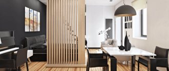
The partition between the hallway and the living room is dismantled, which makes the rooms more spacious and provides freedom of movement. For zoning, a narrow shelving unit is used here: it visually separates the hallway from the living room, and souvenirs can be placed on it. In addition, the functional areas differ in floor coverings: in the hallway - large-format (60-60 cm) polished gray tiles, and in the living room - laminate with a zebrawood texture
Another partition with a door - between the kitchen and the corridor - is also being demolished. Now a cozy dining area is visible in the open opening, and behind it there is a view of a glazed loggia with a winter garden. The kitchen differs from the living room in color scheme: here a muted pink color appears as an additional accent (upholstery of chairs, stripe on the hemmed cornice above the kitchen front). At the same time, thanks to the use of wall panels finished with zebrawood veneer, the design of this room is in harmony with the interior of the entire apartment. The working and dining areas have separate lighting.
The office is designed laconically, in a modern style. There are convenient shelves for storing books, CDs and business papers, as well as a large work area. The original slatted ceiling structure is made of light beams.
The bedroom is decorated in the energetic style inherent in the entire apartment. The wall behind the bed is covered with wallpaper in a deep turquoise tone with brown zigzag lines. The dark background at the headboard creates a feeling of security, and the color and pattern are reminiscent of a cozy curtain of foliage in a grove.
Strengths of the project:
by dismantling the window sill blocks on the balcony and loggia, the insulation of the rooms has been improved; an extended tabletop located along the window makes it possible to organize a comfortable work area by dividing the larger room into two parts; an isolated office can be used as an additional bedroom; dismantling the doorway in the kitchen allows for improved insolation of the corridor
Weaknesses of the project:
a combined bathroom, even for a family of two people, may be uncomfortable; dismantling window sill blocks and moving radiators in the kitchen and bedroom will require approval and will increase the cost of repairs
| Project part | 93 thousand rubles. |
| Author's supervision | 30 thousand rubles. |
| Construction and finishing works | 655 thousand rubles. |
| Construction Materials | 230 thousand rubles. |
| Type of design | Material | Quantity | Cost, rub. |
| FLOORS | |||
| Entire facility | Laminate Classen | 39.93 m2 | 22 000 |
| Tile Ka Avorio Flowers (DOM) | 26.57 m2 | 56 000 | |
| WALLS | |||
| Bathroom | Ceramic tiles Cerim | 19 m2 | 44 600 |
| Bedroom | Wallpaper Extravagance (Harlequin) | 3 rolls | 11 200 |
| Living room | Wallpaper Green Wave, Amazone | 2 rolls | 15 000 |
| Wall panels “LightDeco”, “Shkom” (zebrano veneer) | 6.5 m2 | 19 500 | |
| Rest | High-pressure paint, Ecolor color (Derufa) | 9 l | 18 000 |
| CEILINGS | |||
| Bathroom | Zebrawood panels | 4.1 m2 | 7400 |
| Cabinet | Decorative ceiling (to order) | 10.2 m2 | 8500 |
| Rest | High-quality paint Derufa | 18 l | 6100 |
| DOORS (complete with fittings) | |||
| Hallway | Steel – “Forpost” | 1 PC. | 27 500 |
| Rest | Interior – Jite | 2 pcs. | 8100 |
| Sliding partitions DENI-design | 3 pcs. | 144 000 | |
| PLUMBING | |||
| Bathroom, kitchen | Console toilet, IDO sink | 2 pcs. | 14 000 |
| Installation of Duofix (Geberit) | 1 PC. | 8200 | |
| Acrylic bathtub Jacob Delafon | 1 PC. | 15 960 | |
| Kitchen sink Andalucia (Reginox) | 1 PC. | 3400 | |
| Longran mixers | 2 pcs. | 8900 | |
| Margaroli heated towel rail | 1 PC. | 9950 | |
| ELECTRICAL INSTALLATION EQUIPMENT | |||
| Entire facility | Sockets, switches - BJC | 59 pcs. | 26 300 |
| LIGHTING | |||
| Entire facility | Lamps (Spain), Wofi LEDs | — | 224 050 |
| FURNITURE AND INTERIOR DETAILS (including custom-made) | |||
| Hallway | Wardrobe IKEA | 1 PC. | 23 400 |
| Shoe cabinet “Stolplit”, pouffe “Dis” | 2 pcs. | 15 900 | |
| Kitchen | Kitchen “Stolplit” (without appliances) | 4 linear m | 69 800 |
| Table, chairs – “Eco-furniture” | 5 pieces. | 35 560 | |
| Bedroom | Furniture Flash (Veneran) | — | 236 550 |
| Shelves (Russia), pouffe "Nick" | 3 pcs. | 8900 | |
| Living room | Sofa "Monsoon" (Anderssen) | 1 PC. | 59 000 |
| TV stand (to order) | 1 PC. | 15 000 | |
| Decorative partition-rack | — | 23 400 | |
| Cabinet | Sofa – Anderssen | 1 PC. | 39 900 |
| Bathroom | Tabletop; Alumdecor wardrobe, chair | 1 PC. | 41 100 |
| Illuminated panel (to order) | — | 53 000 | |
| TOTAL (excluding cost of work and consumables) | 1 320 170 | ||
Variations on the theme of pop art.
Project concept:
Creating a bright, positive interior based on the popular style of the 60s. XX century
The project was created for a young married couple. It is designed to preserve the feeling of a bright, unforgettable holiday in the daily life of the newlyweds together, and to prevent it from becoming gray and boring. It is assumed that the wife is a student and the husband often works at home on the computer, so they need two workstations. The designer offers a slightly daring interior solution in a style close to pop art. The latter flourished in the 60s. XX century His signature visual images include Hollywood stars (including gangster movie characters), iconic pop characters, and items such as the much-advertised Campbell's Soup can, Coca-Cola, and, of course, dollar bills.
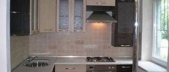
The layout of the apartment is almost not subject to change - the redevelopment affects only the partition between the kitchen and the hallway. It is dismantled and a new one is erected (moving towards the window) from foam blocks, and the entrance door is to the right, which allows you to increase the length of the kitchen front. As a result, there is room in the kitchen for a furniture column with a radius facade; A washing machine and dishwasher are also installed here. To hide the air duct running from the hood to the ventilation duct, a decorative two-level structure is built on the ceiling. Thanks to its simple, laconic form, it does not burden the interior of a small room, and the two-colored ends help to fit it into the overall color scheme of the kitchen. The walls are leveled and covered with blue water-based paint. The floor is decorated with a bright porcelain stoneware “mat”. The color accents in the dazzling white and blue kitchen are black glossy furniture facades, a table with a glass top and bright yellow plastic designer chairs. The originality of the interior is given by an “apron” made of tiles with a pattern applied using photo printing technology (images in the style of English postage stamps). To save space, the double swing door in the living room is replaced with a single-leaf sliding door (for this purpose the doorway is narrowed).
A gypsum plasterboard partition with an arched opening is being erected in the living room. It divides the room into two functional areas - an office with two workstations (in the bay window) and a relaxation area with a home cinema. For the latter, a gypsum plasterboard structure is mounted along the wall in the living room, into which sound speakers are built. In the office, a large tabletop is installed around the perimeter of the bay window, and on both sides of it there are built-in bookcases. The living room most clearly embodies the main idea of the project - the use of elements of the style of the 60s. XX century Thanks to the yellow-painted walls, even in cloudy weather, the room seems to be flooded with bright sunlight. The wall with the TV is covered with multi-colored striped wallpaper. A glossy stretch ceiling of rich color creates the effect of an “emerald sky”. The hallway area allows for a storage system consisting of three separate cabinets. To the right of the entrance are wardrobes, between them is a chest of drawers with a mirror, above is a pendant lamp, to the left is a closet for seasonal shoes.
The decoration of the bedroom matches the overall style of the home. A spacious wardrobe with mirrored and white matte doors is built in here. They are decorated with vinyl graphic stickers. Instead of ordinary bedside tables, custom-made wall tables are used along with a wall-mounted dressing table and a mirror. The central element of the room's interior, along with the bed, is a gypsum plasterboard structure that seems to flow across the ceiling from one wall to another. It visually combines the sleeping area and the TV screen. A poster with a portrait in the pop art style is placed in the resulting frame above the bed. The walls are covered with paper wallpaper with stripes in candy colors.
Strengths of the project:
Minimal changes in the apartment layout Spacious storage systems in the bedroom and hallway Comfortable workspace for two in the living room Increasing the length of the kitchen front by moving the partition
Weaknesses of the project:
reducing the kitchen area due to the arch in the living room; there will be insufficient daylight in the back of the room
| Project part | 66 thousand rubles. |
| Author's supervision | 30 thousand rubles. |
| Construction and finishing works | 990 thousand rubles. |
| Construction Materials | RUB 39,600 |
| Type of design | Material | Quantity | Cost, rub. |
| FLOORS | |||
| Entrance hall, kitchen, loggia, balcony | Porcelain tiles, decor – Kerama Marazzi | 27 m2 | 33 950 |
| Living room, bedroom | Balterio laminate | 36.8 m2 | 44 160 |
| Bathroom, toilet | Ceramic tiles Suite (FAP Ceramiche) | 2.7 m2 | 6000 |
| WALLS | |||
| Kitchen "apron" | Ceramic tiles with photo printing (Italy) | 3 m 2 | 90 000 |
| Bedroom, living room, hallway | Paper wallpaper Eijffinger | 18 rolls | 41 300 |
| Bathroom | Ceramic tiles, decor – Suite (FAP Ceramiche) | 16 m2 | 113 000 |
| Rest | High-pressure paint, Dulux color | 15 l | 6600 |
| CEILINGS | |||
| Living room, bathroom, toilet | Extenzo stretch ceiling | 17.2 m2 | 36 300 |
| Rest | Dulux high quality paint | 16 l | 7040 |
| DOORS (complete with fittings) | |||
| Hallway | Steel door "Forpost" | 1 PC. | 38 200 |
| Kitchen, bathroom, toilet, bedroom | Interior doors "Onyx" | 4 things. | 89 600 |
| Living room | Sliding partition Mistral | 1 PC. | 24 000 |
| PLUMBING | |||
| Bathroom, toilet, kitchen | Cast iron bathtub Roca | 1 PC. | 16 200 |
| Villeroy Boch bowl washbasin | 1 PC. | 16 100 | |
| Faucets, shower sets - Hansgrohe | 3 pcs. | 14 800 | |
| Roca toilet | 1 PC. | 8800 | |
| Electric heated towel rail Somatherm | 1 PC. | 7600 | |
| Entire facility | Aluminum radiators Kermi | — | 28 100 |
| ELECTRICAL INSTALLATION EQUIPMENT | |||
| Entire facility | Sockets, switches – Legrand | 33 pcs. | 7100 |
| LIGHTING | |||
| Living room | Luminaires on the Eglo bus system | 2 pcs. | 10 200 |
| Rest | Lamps (Italy, Spain) | 19 pcs. | 71 000 |
| FURNITURE AND INTERIOR DETAILS (including custom-made) | |||
| Entrance hall | Wardrobes, chest of drawers, pouf - IKEA | 5 pieces. | 104 000 |
| Kitchen | Kitchen “Maria” (without appliances), countertop (laminate, Botticino marble color, 3D-Acryl edge) | 4.3 linear m | 133 000 |
| Round table with glass top, Vitra chairs (designer - Verner Panton) | 4 things. | 36 400 | |
| Living room | Super Roy sofa, Astra armchairs – Il Loft | 3 pcs. | 456 700 |
| Cabinet for equipment, coffee tables (Italy) | — | 156 000 | |
| Tabletop (laminate), armchairs, bookcases, cabinet; shelves (Russia) | 6 pcs. | 99 600 | |
| Bedroom | Built-in wardrobe SimplexGroup | 1 PC. | 75 500 |
| Bed (Russia) | 1 PC. | 72 600 | |
| Dressing table, mirror, stool, shelves (custom) (Russia) | 6 pcs. | 48 400 | |
| Bathroom | Shelf-underframe for the sink (Russia), treated wood | — | 2800 |
| Mirror "1 Moscow Mirror Factory" | — | 4400 | |
| Entire facility | Textiles (curtains, tulle, bedspreads, pillows) (Belgium, Sweden) | — | 89 000 |
| TOTAL (excluding cost of work and consumables) | 1 988 450 | ||
The effect of surprise
Project concept:
Minimal redevelopment, creation of bright stylistic images through the use of art objects.
This project is intended for a young couple and their six-year-old son. The bright, contrasting, dynamic interior style is designed for cheerful modern people without complexes who love shows, performances and adventures. The design solution is based on the use of furniture of various shapes and colors, a combination of large white and colored spots (wall planes), which form spatial accents and tie together disparate parts.
Architects try to blur the boundaries of different zones by introducing a large amount of glass into the interior. There is a glass partition between the hallway-hall and the living room, and frosted glass doors in the bedroom and nursery. Thus, light penetrates everywhere and connects everything, making the space light and airy. Only in the bedroom is a calm corner reminiscent of a country house with wooden walls, a strip of “lawn”, and rustic textiles. As the authors of the project believe, “it’s easy to demolish the partitions, but this will not solve the planning problem. Space must be treated with care.” So they achieve the desired results with some changes. For example, they arrange a passage to the kitchen through the living room. Thanks to this, it is possible to enlarge the guest bathroom due to the corridor and allocate space for a mini-laundry room. Another achievement is that a compact wardrobe is built in the center of the apartment, separating the hallway/hall from the living room.
In order to rationally use the available meters, one of the walls of the living room is expanded with a plasterboard false wall and niches are arranged in it for a home library and a collection of souvenirs. Of course, books and memorabilia can be stored in cabinets and on racks, but this is too common. In addition, this solution allows you to get by with a minimum of furniture and make maximum use of the relief of the wall surfaces. Instead of a TV, there is a home theater with a film projector and screen. A flowery patterned sofa takes up a lot of space, but if desired, all family members can sit comfortably on it. The decor of the living room resembles a kind of exhibition: a designer coffee table-sculpture, a graphic minimalist cabinet under the screen, souvenirs brought from different countries.
In the kitchen, shiny surfaces enliven the geometric interior: black and red lacquer, polished stainless steel and glass sparkle and reflect light. Straight lines and clear stripes (furniture fronts, floor coverings) are balanced by the rounded shapes of a layered “cocoon” chandelier, stool, and chair backs. The “straightness” of the kitchen is reconciled with greenery - the emerald color of hanging plants sets off the snow-white wall.
In the nursery, the preschooler is given complete freedom. A bright, colorful room is decorated with different wallpapers. One of the white walls was thoughtfully artistically “stained” with paint, and now any new blots on it will look like the result of the boy’s creativity. There is a variety of lighting here: numerous sconces on the walls, a cluster of ball chandeliers on the ceiling. The base of the bed, made of luminous cubes, serves as a night light so that the child is not afraid in the dark.
The interior of the parents' bedroom resembles the decor of a country house. The walls and ceilings are finished with boards, making the room more comfortable and warm. At the entrance to the bedroom, an additional compact dressing room is arranged so as not to clutter the rooms with massive, “oppressive” wardrobes.
Strengths of the project:
increasing the area of the guest bathroom, which made it possible to install a washing machine in it; the area of the large hallway-hall, comparable in size to the room, is functionally involved - there is a workplace here; spacious dressing rooms in the hallway and in the bedroom; dismantling the window sill block has significantly improved the insolation of the kitchen
Weaknesses of the project:
making an opening in the load-bearing wall between the kitchen and the living room will require coordination, as well as strengthening the walls in this area; the living room becomes a walk-through; the living room is reduced; waterproofing part of the floor in the guest bathroom
| Project part | RUB 193,500 |
| Author's supervision | 30 thousand rubles. |
| Construction and finishing works | 881 thousand rubles. |
| Construction Materials | 345 thousand rubles. |
| Type of design | Material | Quantity | Cost, rub. |
| FLOORS | |||
| Entire facility | Ceramic tiles Ceramica Magica | 35 m2 | 70 300 |
| Parador solid board | 61 m2 | 151 000 | |
| WALLS | |||
| Bedroom | Wallpaper AS Creation | 2 rolls | 4900 |
| Wall panels (wood) (Russia) | 12 m2 | 5600 | |
| Children's | Wallpaper BN International | 5 rolls | 3900 |
| Bathroom, toilet | Ceramic tiles Ceramica Magica | 35 m2 | 54 300 |
| Rest | High-pressure paint, color Oikos (X-Deco) | 12 l | 34 960 |
| CEILINGS | |||
| Bedroom | Decorative board (Russia) | 12 m2 | 5600 |
| Rest | High-pressure paint Oikos (X-Deco) | 24 l | 20 800 |
| DOORS (complete with fittings) | |||
| Hallway | Steel - "The Door Called the Beast" | 1 PC. | 42 700 |
| Rest | Effebiquattro swing doors | 2 pcs. | 32 400 |
| Glass swing doors Casali | 3 pcs. | 216 000 | |
| PLUMBING | |||
| Bathroom, guest toilet | Acrylic bathtub Prima B (Doctor Jet) with hydromassage | 1 PC. | 69 000 |
| Toilets, compact - GSI, Geberit installations | 4 things. | 52 800 | |
| Sinks, one - with Hatria underframe | 2 pcs. | 40 800 | |
| Faucets, shower sets - Hansgrohe | 3 pcs. | 24 400 | |
| Electric heated towel rails Energy | 2 pcs. | 13 700 | |
| ELECTRICAL INSTALLATION EQUIPMENT | |||
| Entire facility | Sockets, switches – Merten | 51 pcs. | 9800 |
| LIGHTING | |||
| Entire facility | Fluorescent lamps (Italy) | 39 pcs. | 411 600 |
| FURNITURE AND INTERIOR DETAILS (including custom-made) | |||
| Entrance hall | IKEA cabinet components | 1 PC. | 6900 |
| Tabletop (custom), chair (Russia) | 2 pcs. | 24 900 | |
| Wardrobe | Wardrobe components, doors – Rimadesio | — | 180 700 |
| Kitchen | Kitchen “RIMI” (without appliances), Montelli countertop | — | 168 600 |
| Table (Russia), stool, chairs (to order) | 6 pcs. | 58 200 | |
| Living room | Sofa "Fiesta furniture", TV stand, coffee table (Italy) | 3 pcs. | 85 000 |
| Bedroom | Bed, nightstands - “VEF”, pouf (Russia), tabletop on consoles (to order), mirror in frame (Russia) | — | 84 500 |
| Children's | Children's furniture Slide | — | 90 000 |
| Loggia | Coffee table, armchair, ottoman - IKEA | 3 pcs. | 32 800 |
| TOTAL (excluding cost of work and consumables) | 1 996 160 | ||
Areas of apartments in houses of the GMS-1 series
| Number of rooms in the apartment | Total area, m2 | Living area, m2 | Kitchen, m2 |
| 1 | 26-29 | 17-19 | 9-10 |
| 2 | 38-54 | 29-43 | 9-11 |
| 3 | 49-73 | 40-61 | 9-12 |
| 4 | 75-84 | 64-72 | 11-12 |
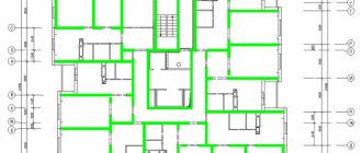
Apartments in the houses of the GMS-1 series are equipped with glazed loggias. The street walls of residential buildings are multi-layered; they consist of 2 reinforced concrete slabs, between which insulation is placed. The total thickness of the external walls is 34 cm. Reinforced concrete slabs 18 cm thick are used as inter-apartment partitions. Interior walls are made of 14 cm gypsum concrete, floors are made of reinforced concrete 16 cm thick. Most of the walls between rooms and apartments are load-bearing. Accordingly, redevelopment of housing is possible only if certain permits are obtained.
Disadvantages of apartment buildings of the GMS-1 series
Despite the presence of a large number of advantages, the houses of the GMS-1 series are not without some shortcomings. Among the main disadvantages faced by apartment owners, it is worth noting:
- restrictions when carrying out redevelopment - due to the fact that most interior walls are load-bearing;
- narrow corridors.
Despite these shortcomings, apartments from Glavmosstroy are in demand. They are affordable, safe and comfortable to live in.
To repair joints between slabs, partial opening of the seam and application of a fresh layer of sealing compound can be used.
We carry out high quality and professional sealing in a variety of ways and offer you:
* insulation of lintels/lintels after repairs of loggias/balconies;
* arrangement of joints in old-type buildings, with opening of plastered joints;
* complete opening of joints, replacement and application of new insulation;
* incomplete opening of joints, partial replacement and sealing of seams.
Zheleznodorozhny, Rozhdestvenskaya street 2,4,6,8,10
st. Bazovskaya 15 building 1,2,4,6,8,9,10,11.12;13;14;15,16
WHAT TECHNOLOGY DO WE OFFER?
To ensure that the insulation of interpanel joints is carried out at the highest level, we use advanced “warm seam” technology. During the work, we place tubular insulation in the seams, choosing the required diameter of this building material. The type of insulation is reminiscent of hose-like tubes. It is made using polyethylene foam and has many tiny closed pores inside. Polyethylene foam products are practically incapable of absorbing water and perfectly insulate heat. Preference is given to Vilaterm. However, Isonel, Plenex and Energoflex also have their own positive characteristics.
As a rule, problems with depressurized joints appear on the lower and upper floors of the building. The first and zero levels suffer from moisture created by precipitation. The liquid runs through the joints, using the hygroscopicity of finishing and building materials. The upper floor is not resistant due to the technical level, where liquid accumulates in the cavities of the seams.
Examples of prices for work
| No. | Name of works | Unit Change | Cost per unit |
| Floors | |||
| 40 | Installation of vinyl tiles | m/2 | 750,00 ₽ |
| 41 | Floor plug installation | m/2 | 420,00 ₽ |
| 42 | Installation of plastic plinths | m/n | 150,00 ₽ |
| 43 | Installation of PVC skirting boards | m/n | 180,00 ₽ |
| 44 | Washed down PVC skirting boards | PC. | 100,00 ₽ |
| Walls | |||
| 82 | Laying clinker bricks | m/2 | 1 400,00 ₽ |
| 83 | Laying artificial stone | m/2 | 1 400,00 ₽ |
| 84 | Laying natural stone | m/2 | 1 550,00 ₽ |
| 85 | Cladding walls with clapboard | m/2 | 590,00 ₽ |
| 73 | Textured plaster installation | m/2 | 650,00 ₽ |
| Ceiling | |||
| 100 | Painting ceiling molding (gypsum) | m/n | 290,00 ₽ |
| 100 | Installation of tiles for the ceiling (caramogranite, ceramic, 10*10 to 60*60) | m/2 | 1 450,00 ₽ |
| 101 | Mosaic installation on the ceiling | m/2 | 1 600,00 ₽ |
| 101 | Grouting tile joints on the ceiling | m/2 | 200,00 ₽ |
| 102 | Fabric stretch ceiling device | m/2 | 850,00 ₽ |
| Electric installation work | |||
| 136 | Installing and connecting a telephone socket | PC. | 174,00 ₽ |
| 137 | Installation and connection of fans | PC. | 1 250,00 ₽ |
| 138 | Installation and connection of the heated floor controller | PC. | 1 160,00 ₽ |
| 139 | Installation and connection of a lamp in the ceiling (gypsum plasterboard or stretch ceiling) | dot | 480,00 ₽ |
| 142 | Connecting the electrical panel to the central power supply | PC. | 1 420,00 ₽ |
| Plumbing | |||
| 184 | Installation and connection of a food chopper | PC. | 1 900,00 ₽ |
| 185 | Installation and connection of the sink | PC. | 1 650,00 ₽ |
| 186 | Installation and connection of a floor-standing toilet | PC. | 2 800,00 ₽ |
| 187 | Installation and connection of a wall-hung toilet | PC. | 5 500,00 ₽ |
| 188 | Installation and connection of a hygienic shower | PC. | 1 800,00 ₽ |
| Dismantling works | |||
| 198 | Removing old insulation (mineral wool) | m/2 | 150,00 ₽ |
| 199 | Dismantling of monolithic partitions | m/2 | 1 460,00 ₽ |
| 202 | Dismantling the laminate | m/2 | 130,00 ₽ |
| 203 | Dismantling the Parquet Board | m/2 | 155,00 ₽ |
| 204 | Dismantling solid wood | m/2 | 245,00 ₽ |
| Ancillary work | |||
| 213 | Removal of construction waste | gazelle | 2 500,00 ₽ |
| 214 | Construction waste removal | container | 4 800,00 ₽ |
| 216 | Lifting building material | kg. | 2,00 ₽ |
| 219 | Cleaning the apartment after renovation | m/2 | 80,00 ₽ |
| 220 | Delivery of rough material (Gazelle 1500 kg) | PC. | 1 250,00 ₽ |
| Slopes | |||
| 223 | Installation of slopes from gypsum plasterboard | m/n | 450,00 ₽ |
| 224 | Primer of slopes before putty | m/n | 50,00 ₽ |
| 228 | Painting slopes | m/n | 220,00 ₽ |
| 229 | Laying tiles on slopes | m/n | 650,00 ₽ |
| 230 | Installation of PVC slopes | m/n | 460,00 ₽ |
| Installation work | |||
| 245 | Installation of a room door | PC. | 2 500,00 ₽ |
| 246 | Installation of extensions to an interior door (set) | PC. | 800,00 ₽ |
| 248 | Installation of accessories (hooks, holder, stand, door lock) | PC. | 450,00 ₽ |
| 249 | Installation of a cabinet in a bathroom. Knot | PC. | 1 350,00 ₽ |
| 250 | Assembly and installation of the bathroom cabinet. Knot | PC. | 2 160,00 ₽ |
Full price list for services
COST OF JOINT SEALING SERVICES
In order to find out the exact cost of joint sealing services, you need to contact our specialists. However, we can tell you approximate amounts right now:
* 30 linear meters - 1 room apartment;
* 30..39..46 linear meters - two-room apartment; depending on its location in the house (end or non-end, corner)
* 3-room apartment in this series - from 44 (not end) to 74 linear. (end)
As a rule, the square meters of one-room housing are less than 30 linear meters. meters, regardless of whether we are talking about an end or non-end apartment. The cost of work for the STANDARD option is 10,500 rubles, for Warm seam - 3,000 rubles more. It also matters whether it is necessary to open the seam completely or partially.
13,500 rubles is the minimum order amount for insulation of interpanel joints. The price already includes all possible expenses - materials, services themselves, payment for access to the roof.
Coordination of services with representatives of regulatory organizations, for example, with DEZ, is undertaken by the specialists of our company.
How to order repairs to the interpanel seams of your apartment?
The application is made 1-2 working days before the start of work.
This time will be needed to obtain permission to work from Des or the management company. The work itself on external sealing of panel joints is carried out during the day from 9-00 to 19-00. To make an application: - Call ☎, and the manager will accept your application and answer your questions. For the convenience of customers, a calculator has appeared on the company’s website to calculate seam insulation services. In order to calculate the cost of sealing, you need to select the number of storeys of the house and the type of insulation. Then click on the CALCULATION button, after which the card for filling out the client’s data will open:
⇆ Calculation
What you need to know about sealing seams: / Who should insulate interpanel seams and at whose expense? / How to force the management company to seal interpanel seams? / Reasons for the appearance of mold on the walls of an apartment / The walls in a panel house freeze, what should I do? / Typical mistakes in sealing seams between panels / Instructions, building codes, VSN, regulations for sealing seams
Examples of completed work
We are ready to provide you with a design project, where you can familiarize yourself with all the details and features that your apartment will have after the completion of the renovation work. Play of light, heated floors, multi-tiered ceilings - LionGroup specialists will do all this and much more without any problems.

