How to arrange a gray kitchen, what materials, finishes and accessories to choose? We'll tell you in our article!
Gray continues to reign supreme in modern interiors because it pairs well with other colors and materials, and the right shade doesn't overwhelm even a small space. A kitchen in ash or graphite shade will not cease to be fashionable for many years to come.
Read our article to find out how to design an interior that will stand out from others with a similar color scheme. We will tell you how to choose colors so that a kitchen in anthracite, gray or light gray will delight you with its extraordinary appearance.
What will you read about in the article?
- Gray kitchen - what colors to complement it with?
- Gray kitchen furniture - what appliances should it be combined with?
- Which countertop is suitable for a gray kitchen?
- Gray kitchens - modern interiors
- Gray kitchen with wood - a fashionable combination for all times
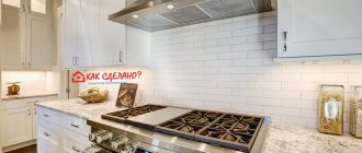
What is a kitchen apron?
Installing cladding on the entire wall behind the stove is impractical, since most of it is hidden by furniture. Therefore, only the visible gap between the countertop and wall cabinets is covered. This type of finishing is called an apron. In rooms with a corner set, it occupies 2 walls.
Functions
The apron performs the following tasks:
- Protects the main material of the wall from high temperature, humidity and substances that fall on it during cooking.
- Facilitates the removal of contaminants.
- Serves as a decoration for the kitchen, complementing the overall interior design.
Requirements
Only cladding with the following qualities performs its functions:
- Moisture and heat resistance.
- High strength.
- Smooth, non-absorbent surface. It is easy to remove grease, soot and other contaminants from it.
- Chemical inertness. This allows the use of effective detergents.
- Fire resistance.
- Environmentally friendly. Materials that emit harmful substances are not suitable.
- Aesthetic appeal. The apron looks good and does not clash with furniture and other finishing materials.
Requirements for apron material
When choosing modules in the catalog of kitchen aprons, you should pay attention to the characteristics of the selected material. The basis for creating a protective coating over the hob must meet a number of requirements:
- Strength of the material. The strong structure gives the material resistance to mechanical deformation.
- Moisture resistant. The presence of an apron requires frequent cleaning of the work area, and therefore the coating should not be afraid of moisture.
- High temperature resistance. The heat from the hob can damage some of the materials used to create backsplashes.
In addition, they pay attention to the appearance, presence of decor and environmental indicators. The manufacturing technology should not use toxic or flammable varnishes and paints.
Features of decorating a tile apron in the kitchen
The following materials have the necessary characteristics:
- Metal. Not suitable for home furnishings unless they are designed in a high-tech style.
- Glass.
- Ceramic tile.
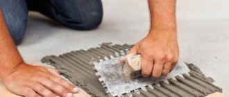
In most cases, the third finishing option is used. Ceramic tiles are made from different types of clay; to impart the required properties, they are fired in ovens and covered with glaze (a thin layer of glass).
Fixation on the wall is done using special glue.
Seams are left between the modules, which provides double benefits:
- Monotony is eliminated, the apron looks more interesting.
- Uneven tile edges are masked.
The seams are filled with a special solution - grout. It is better to choose epoxy. The color of the grout is several shades lighter than the tiles.
Advantages and disadvantages of the material
| Advantages | Flaws |
| Low cost compared to glass and metal counterparts. The low price is due to the low cost of raw materials and production technology | Difficult installation. It is impossible to properly glue the cladding with your own hands; the services of a professional are required |
| Security. Broken fragments are not capable of damaging as much as glass. | Difficult to process. Special tools are required for cutting, drilling and cutting openings |
| A wide variety of colors, shapes and textures. There is a suitable option for any interior style | Heavy weight |
| Durability of tiles | Flat base for fixing tiles |
| It looks good and holds strong even after decades | Presence of seams |
Gray kitchen with wood - a fashionable combination for all times
A gray kitchen with wood is a popular choice due to the ongoing affinity for Scandinavian style. Usually a combination of ash furniture with a top made of natural lightweight material is used. However, this is not the only way to decorate a gray kitchen with wood, as natural raw materials can also appear on the walls or floor. If you are concerned about the poor reaction of wood to moisture, use materials that imitate it.
Criteria for choosing material for the working wall
The tiles are selected according to the following parameters:
| Type | Determined by the type of raw materials and production technology |
| Form | Square, rectangle, rhombus, triangle, hexagon, freeform |
| Size, cm | 10*10; 27*40; 30*60; 25*60; 25*20; 33*60; 31*90; 12*6.5; 25*10; 28.5*8.5(like brick), mosaic |
| Color | It is better to opt for light shades, since everything will be visible on a dark apron: drops from fat, water, steam. At the same time, light grout will create a high contrast, and dark grout will make a small kitchen gloomy |
| The presence of a drawing, pattern | There are currently many options on the market to suit different tastes. If you want to save money, it is better to choose a monocolor option |
| Texture | Preference is given to varieties with a smooth surface. Textured tiles look more interesting, but they are more difficult to remove dirt from. |
| Texture | Matte, glossy |
| Calibration | Dimensional tolerance. You should choose tiles with the same color scheme. |
| Durability of the coating protecting against chemically active substances | The strength of the protective coating is indicated by a letter in the marking. Ee indicate on the box. For an apron, a material with chemical resistance class “AA” is best suited. Such tiles will not tolerate any changes after interaction with household chemicals and grease. If class “A” is indicated, then over time the glaze may lose its original appearance |
Kitchen furniture
When choosing the design for your kitchen, remember the correct ratio of the base and additional colors. Since furniture takes up most of the kitchen space, pay special attention to its colors - the final impression of the kitchen will depend on it.
A matte set in smoky tones is considered a good solution. If you want to make your room design more glossy, use shiny surfaces. Combining them with stainless steel appliances, you can achieve a truly amazing effect.
Matte set of wooden tabletop
A popular design move is installing a kitchen island. It is recommended to make it more contrasting compared to the rest of the furniture. Another modern trend is the choice of a kitchen set without wall cabinets. This design is often used to create a Scandinavian style.
It is appropriate to purchase furniture made from natural materials - for example, wicker chairs or rattan items. A tabletop made of natural wood will complement the stylish appearance.
Main types
Tiles are produced in a wide variety. Some species are more common than others. For example, they mainly use material with a smooth glossy surface, since it is easiest to remove dirt from it. In addition, such tiles, due to the play of light, visually enlarge the room. But grease and water marks are more visible on it than on matte.
Stereo tiles
When producing stereo or 3D tiles, microlens technology is used. Thanks to it, the applied picture appears three-dimensional. This cladding looks extremely impressive, but is expensive and places high demands on the quality of installation.
3D tiles in a kitchen splashback.Diamond-shaped
Diamond shaped tiles are becoming increasingly popular. An apron made from it has an unusual look; it looks good in a classic interior, country and Provence styles. This type of finish is also used in modern design, giving preference to modules with ornaments or photo printing.
Metlakhskaya
Metlakh tiles are small in size and come in a wide variety of shapes and colors. In addition to square modules, there are polygonal and shaped ones.
This allows you to assemble patterns of any complexity, reminiscent of a carpet.
The modules are covered with a thick layer of glaze; their characteristics resemble porcelain stoneware.
Hexagonal
Using hexagonal tiles, they create an attractive and original pattern reminiscent of a honeycomb. The tiles are produced in a wide variety, the side length varies from 6 to 48 cm.
To make the broken lines formed by the seams stand out more clearly, use a contrasting grout.
Geometric abstraction
The kitchen backsplash is often tiled with an abstract geometric pattern. It is necessary to choose a pattern so that the cladding does not look overloaded. The color is chosen taking into account the shade of the furniture and other finishes.
5 layout options for a modern kitchen in gray
The first step in creating any design is, first of all, the choice of a set, its components, configuration, arrangement of furniture in the kitchen as a whole.
The layout can be:
- straight;
- corner;
- in the shape of the letter “P”;
- with a peninsula/island;
- with a bar counter.
Trends characteristic of a gray kitchen in a modern style
Surely, when looking at the design of a gray kitchen in a modern style in references or photos, you noticed that sets with handles in this case are presented quite rarely. And they are almost all with upper cabinets up to the ceiling, or without them at all. And, of course, a frequent guest here is built-in appliances.
These are the trends that are a priority now. Therefore, take them into account if you want to create a truly fashionable interior.
Manufacturing materials
Tiles are made from different materials. The strength and appearance of the cladding depends on this.
Ceramic
There are several types of ceramic tiles:
- Majolica.
- Earthenware.
- Porcelain.
- Cottoforte.
All varieties are suitable for making an apron, except earthenware. Its porous structure actively absorbs dirt in places where the glaze has abrasions or microcracks.
Glass
Glass tiles are used less often than ceramic tiles, mainly in designer interiors.
It comes in 2 types:
- transparent;
- colored.
The surface can be matte or glossy.
Transparent tiles with leaves or flowers inside are popular. Glass modules are often used as inserts between ceramic ones.
Mirror
A mirrored apron serves as an interior decoration and visually enlarges the kitchen. But this is an option for a family of 1-2 people using the kitchen with relatively low intensity. The reason is that even slight dirt on the mirror immediately catches the eye.
Clinker
Unlike others, clinker tiles are molded under a press. As a result, it has increased density, which has a positive effect on hardness and strength.
The material has a rough surface, so aprons are rarely made from it.
Mainly in design projects, when it is necessary to emphasize the glossy surface of furniture.
Made from artificial stone and porcelain stoneware
Cladding made of artificial stone looks expensive and durable.
It can simulate:
- marble;
- granite;
- onyx;
- malachite;
- basalt;
- sandstone.
The material is made from stone chips with the addition of one of the binders:
- Cement.
- Polyester resins.
In the production of porcelain stoneware, stone chips are not used, but in appearance it also looks like rock.
The initial mixture is prepared from the following components:
- White clay.
- Spar.
- Quartz sand.
- Natural pigments.
The texture of stone is best reproduced by large-format modules.
The disadvantage of these materials is their low heat resistance - after contact with hot dishes, a matte mark remains on the surface. They are protected from this with a colorless varnish or a special coating, which must be renewed periodically.
An apron made of artificial stone goes well only with a countertop made of the same material.
Apron made of MDF panels
The advantages of using this material are:
- Decorative appearance.
- Natural materials.
- Easy to install the coating with your own hands.
- Relatively low cost of material.
Unfortunately, in some respects, an MDF kitchen apron is inferior to all previous coatings:
- High humidity and high temperatures negatively affect the appearance of the coating. During operation, the material will lose its original original appearance.
- Due to the porous structure, the panels absorb odors, and greasy deposits and soot can eat into the surface layers of the material.
A significant plus is that the panels are easy to replace (they do not require preliminary leveling of the walls, and the price is affordable for the buyer).
Popular formats: tile sizes
The seams between the tiles are clearly visible, so the size of the modules affects the design of the apron. They produce cladding in formats from 5x5 to 50x60 cm.
10x10
Small format tiles have the following advantages:
- Visually increases the size of the room.
- Goes well with compact furniture.
- Makes it easier to cover difficult areas.
- Allows you to implement complex layout options when modules of different colors are used.
- Requires pruning less often.
Flaws:
- High requirements for the tiler's qualifications.
- A large number of seams. They are more difficult to clean from dirt and reduce the reliability of waterproofing.
- It is not in demand in Europe - factories make this tile format mainly for the CIS countries.
Tiles in the 10x10 cm format are mainly used in compact kitchens.
“Boar” or under a brick
Distinctive features of the “hog”:
- Pronounced rectangular shape, reminiscent of a brick. The most common formats are 7.5x15 and 10x20 cm.
- Thickness is 2 cm (for other types - no more than 11 mm).
- Cut corners on the front edge.
Bevels add volume, which gives the backsplash an interesting look. With a vertical arrangement of elongated modules, the cladding visually increases the height of the ceiling.
Under the mosaic
Mosaics are tiles measuring 5x5 cm or less.
It allows you to lay out complex patterns, but has significant disadvantages:
- A high level of skill is required from the tiler.
- There are too many seams in the cladding.
- It is difficult to clean from dirt, especially if there are wide seams.
Mosaic tiles - large modules with small convex fragments or extruded grooves - do not have these shortcomings. The second variety is practically no different from the prototype. The grooves are also filled with grout, but they are not a weak point in the waterproofing.
Medium size
The best option, suitable for most kitchens.
The most popular formats (cm):
- 20x20;
- 20x30.
In difficult places and along the edges, such tiles almost always have to be cut, so you need to prepare a tile or glass cutter.
Finishing
The choice of finishing materials for the kitchen space must be approached with special responsibility.
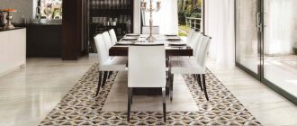
- Floor. The most common coatings in the interior are ceramic tiles, parquet or laminate. Linoleum is also an excellent option. Quite often, floor finishing is combined in the kitchen, for example, the work area is laid out with tiled material, and the dining area is decorated with a warmer wood covering.
- Walls. For walls, it is appropriate to use wallpaper with an unobtrusive pattern or plain canvases for painting. A rough texture will effectively shade gray surfaces, for example, brick, concrete or natural stone.
- Ceiling. In ceiling cladding, ordinary painting, stretched fabrics, multi-level plasterboard structures with built-in lighting, slats or plastic panels can be used. In terms of color, it is recommended to give preference to white shades. The light ceiling plane against the background of gray wall decoration visually looks much higher.
- Apron. The apron area in the interior is finished with small mosaics in a steel color scheme or tiles in the shade of wet asphalt. Gray cabinets will look unusual in combination with an apron lined with brick or its imitation. A luxurious solution is to use materials in the form of marble or painted tiles with ornaments.
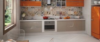
The photo shows a kitchen in gray and white tones with an accent backsplash decorated with red boar tiles.
For doors, choose panels with a pleasant wood color, such as gray oak. These designs do not overload the interior and become an excellent addition to any design project.
Furniture ensemble facades
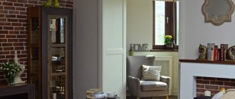
The tone of the kitchen set, which occupies 60-70% of the room's area, largely creates its image and determines the overall aura of the interior. A gray furniture ensemble can be made in a strict, smooth technique or decorated with carvings and exquisite fittings.
Plastic, laminated chipboard, and MDF will serve equally well as materials for its manufacture. A good move to visually expand the room would be to “flow” the light shades of the upper cabinets into the dark, rich tones of the lower tier.
The organic neighbors of gray will be a wide variety of tones of white. So, a milk buffet will be an excellent companion to a gray set. As for the tabletop, it can also contrast favorably with the furniture. A striking granite or silver pigment will make it the headliner of the entire room.
Matte or glossy - which facades to choose?
The choice of matte or glossy finish depends on the intensity of the color. Even minor dirt such as water marks will be more visible on the dark gray glossy surface of the facades, which is very impractical for the kitchen. But gloss can highlight light gray facades to their advantage and will not show fingerprints or stains.
Walls and floor
Choosing a gray color for the base of the kitchen is a more than successful option. A small kitchen or a living room combined with it - in all cases there is exactly the right shade that will turn any room into a unique design idea.
When choosing the color of the walls, it is worth taking into account the dimensions of the room - the smaller the square footage, the lighter the shade. The floor is chosen light gray if the height of the walls is small. With a sufficient indicator, a dark gray tone can be allowed.
Against the background of the general “grayness”, any color will be fully revealed. Therefore, no matter what color of furniture is chosen (be it white, lilac or dark pink), in addition to accessories and kitchen appliances, the final look of the kitchen will exceed the expected result.
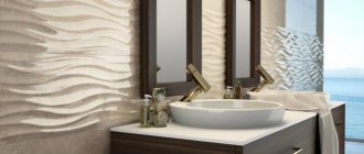
Tabletop
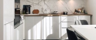
Discreet countertops in ash or granite colors have the amazing ability to blend seamlessly with any shade of furniture facades.
What is attractive about this solution is the easy care of the surfaces and the long-lasting aesthetic appearance, since dirt hardly stands out against the gray background.
A gray countertop is a fashionable and popular solution on the way to creating a functional kitchen interior
Using a gray countertop made of artificial stone will greatly simplify the housewife’s work at home.
Advice! Considering that the countertop must be very durable, withstanding the shock loads of blunt and sharp objects, it is best to make it from stone - artificial or natural.
A modern popular material is acrylic with a wide palette of shades and patterns. Less common are cabinets with a wooden top, which requires careful handling.
A glossy acrylic stone countertop is a universal solution for any kitchen interior
Apron
The design texture is determined at the last stage of design work. It can completely blend in tone with the walls or be contrasting and bright.
The calm, monochromatic gray gloss of the kitchen apron will look organic if the room has rich decorative elements. A textured ornamental print will be appropriate in spacious rooms.
A kitchen apron made in light gray tones and complemented with bright details will look natural and harmonious in any kitchen
Considering the practicality of the grayish color, it is logical to use it to decorate an apron in a kitchen that is frequently visited by household members. The mosaic surface in a steel, expressive color scheme looks great.
A mosaic apron in a well-chosen color will help create a bright, memorable interior
What wallpaper is suitable?
Wallpaper for a gray kitchen can be of a wide variety of colors and materials. Let's look at the most popular of them.
Light wallpaper.
Dark.
Bright.
Modern styles in the interior
There are several stylistic trends in design. The apron must correspond to the chosen concept.
Scandinavian
Due to the lack of sunlight in Scandinavian countries, preference is given to light wall decoration. Therefore, an apron in the same style is made from tiles of various light shades.
Imitation of light wood species is appropriate.
The monotonous cladding is diluted with dark inserts.
Mediterranean
Like Provence and country, this style recreates the atmosphere of a country house.
Tiles that imitate wood or stone look harmonious.
Preferred shades are calm and soft. Decor that brings a rural flavor is welcome: with images of flowers, animals, wicker patterns.
Modern
In modernity, the emphasis is on everything new and unusual.
There are 3 methods of making a kitchen apron:
- Made from safety glass "triplex". It can be matte or transparent with photo printing on the back side.
- Made from mirror tiles. The play of light in such an apron is perfectly combined with the inherent shine of chrome fittings and metal household appliances. But traces of water, grease and other dirt are clearly visible on the mirror, so it often has to be wiped.
- With backlight. A ceramic tile backsplash is made modern with the help of LED strips located directly above it. The light from the diodes emphasizes the beauty of the cladding and gives it a modern look.
High tech
Distinctive features of a high-tech style apron:
- Non-standard shaped tiles: 6- and 8-gonal or diamond-shaped.
- Bright colors. They are selected so as to achieve consistency with the shade of furniture and other finishes.
- Different texture.
When it comes to decor, they follow a minimalist approach - only tiles without a pattern are used. The monotony is compensated by laconic inserts of contrasting colors.
An apron made of glass mosaic or plaster tiles coated with varnish also corresponds to the high-tech style.
Loft
A loft involves designing a kitchen as a technical room.
The following types of tiles are suitable for it:
- “Boar” is red or white. The backsplash looks like a brick wall without finishing.
- With a rough, rough surface similar to concrete, cement plaster or terracotta stone. Clinker material would be appropriate. The modules are stacked offset.
Classic
The classic interior is characterized by restraint and solidity. Calm colors are welcome, for example, sand, beige, walnut, cognac, gray or milky.
Maintains straight lines oriented vertically or horizontally. Therefore, the tiles are laid in the standard way or with an offset.
The classic style goes with antique patterns or images of flowers. It looks good with tiles with a natural stone texture.
Country
This style uses rural motifs. The apron is made from tiles in delicate shades, often with images of flowers. It’s good if it imitates wood, stone or old clay tiles.
For greater expressiveness, a panel with a pastoral scene, for example, a village courtyard, is pasted behind the hob.
The preferred installation methods are herringbone, diagonal or offset.
Provence
Provence is similar to country, it is also designed to create an atmosphere of provincial serenity. The same requirements apply to the apron.
The most frequently asked questions about gray kitchens
1. Gray set + gray walls = too pale combination?
If you play the shades correctly and choose textures, then no!
A good example: combining concrete with materials that have a smooth surface. Brutal interior solutions are trending now. And the texture of concrete cannot be called boring - the material is heterogeneous and with each application it forms various, unique configurations and patterns. Another good thing is that the grayness of concrete can be balanced by using black and white details.
If brutal notes in the interior are not an option for you, but the very possibility of boredom from total gray scares you, use the classic technique: duets of glossy and matte surfaces and materials. For example, the entire set can be made matte, but the inserts can be made glossy. Inserts made of dark solid wood are also appropriate.
Sometimes, to add variety to a monochrome interior, just one bright detail will be enough. For example, such a detail could be a bright red high bar stool. Imagine it on a neutral gray background - it looks very impressive!
And, of course, don't forget about countertops. If you make them white, cabinets with gray fronts will become visually lighter.
Grey/beige: which color is better?
Both shades are classic solutions for creating the most neutral and calm interiors. Plus, they look good together. Therefore, when looking through photos and references of popular designs, you will notice that such a color duet is found in them quite often.
For example, you can make the backsplash and walls beige, and the upper and lower cabinets of the kitchen set in various shades of gray.
And don’t forget that the dining group is also one of the components of the kitchen interior. In this case, you can make the table gray and the chairs in beige wood shades. Or vice versa.
There is another interesting way to combine gray and beige tones in the kitchen. For example, order a set of an ambiguous, complex shade, the perception of which depends on the lighting. The more complex the color, the lower the risk that you will get tired of it soon.
The same technique can be used in the process of painting walls. If you're having trouble deciding on a paint color, add a little gray to the jar. It will add nobility to any color.
To choose the right shades of beige and gray, follow these rules:
- do not create harsh contrasts. For example, if you chose a dark shade of gray, then the beige should be quite dense;
- a combination of light shades of baked milk with gray. The former will make the space warmer, the latter will cool it down. The result will be something in between.
Is it possible to combine gray with wood?
Of course yes. Moreover, this is a classic combination! Wood, just like beige tones, will “insulate” the interior, and gray will “cool” it.
For example, you can make the floor wooden, and gray slats on the ceiling. The result will be a truly Scandinavian interior. The effect will be enhanced if you decorate the backsplash with white tiles.
However, in the absence of any additional accents, perhaps such a design will still look too pale. Therefore, you can decorate the floor with tiles with some active pattern in a gray-blue tone.
Note that wood of a reddish hue has reappeared in trends. If it is combined only with milky and beige tones, there is a risk that the renovation will take on a touch of past years and will not seem modern. To avoid this effect, dilute the design with dense gray textures.
Gray tinted wood is another fresh trend. As a rule, plywood is tinted. And they do it in just one layer. That is, in some places the natural shade of wood still shows through.
What about stone textures?
The most popular option in this case is gray facades in combination with aprons made of material that imitates marble. If you dilute all this with accents of brass and gold, it will turn out very beautiful and stylish.
Option for the more daring: facades similar in tone to elephant skin + stone slab in ocher tones. Here the gray on the facades combines beautifully with the veining in the stone.
The combination of gray concrete and marble is a great idea for modern interiors. Here the whole “trick” is in an interesting contrast: the brutality and rough surface of concrete is contrasted with shiny smooth stone.
Fashionable colors
The tiles are selected by color so that 2 conditions are met:
- The cladding harmoniously combined with the kitchen set.
- The contamination was not noticeable.
Pastel colors
Soft, calm tones are chosen when necessary to highlight bright furniture. The most practical shades are beige and light brown: dirt is not visible on them, especially if there is a pattern on the tile in the form of streaks.
The gray color is diluted with bright inserts or non-standard styling methods are used. This is a neutral background that goes well with any furniture.
Rich colors
A bright apron with rich shades becomes the central element in the interior. Furniture, on the contrary, should have calm tones so as not to overload the perception.
Mirror tiles
If you have a small kitchen space, the choice often falls on mirror tiles. This simple technique allows you to visually create the illusion of a larger space, as if it is expanding.
But taking care of such an interior is much more difficult: any imprint, any drop of water or grease is easily applied and must be constantly washed.
Advantages and disadvantages
- Thanks to the property of reflection, mirror tiles expand the boundaries of the room, making it more spacious and bright.
- It is very difficult to care for such tiles. The tile is very easily soiled and any drop of water or grease is easily applied. This is why it needs to be washed constantly.
- There is one more drawback to mirror tiles. Anyone who prefers to install rails and hang various jars and bottles on them should refuse such tiles, since all these double kitchen utensils will significantly burden the space. And the effect of visual volume simply cannot be achieved.
Kitchen apron decor: original ideas
The small height of the apron limits the designer's imagination. To escape monotony, non-standard techniques are used.
Insert tiles with flat or relief patterns
The format of the inserts is the same as that of the main tile; they differ only in appearance. They are glued in the following ways:
- One at a time in a strict order, for example, through 3 main modules.
- The same, but chaotic.
- In groups of 4 or 6 pieces. in the form of a panel.
Decorative panel
Manufacturers often include panels in tile collections - modules depicting flowers, animals, landscapes, etc. The size of the painting is 50x50 cm or more. It can be integral or composite. In the second case, the image is assembled from 4 or 6 fragments.
Frieze
A frieze is a name given to narrow elements that perform a decorative function.
They are used as follows:
- Lay out the edging of the apron.
- Used as a separator between tiles from different collections.
- Paste in the form of a horizontal strip at the middle height of the apron.
In most cases, the frieze is decorated with ornaments.
Under concrete
For a loft-style kitchen, tiles that imitate a concrete surface are suitable. It looks like there is no finish on the wall, but the base is protected and dirt is easy to remove.
They also produce tiles for cement.
Decor pencil
A pencil is a narrow ceramic element the width of a finger.
Its use provides double benefits:
- Creates an interesting visual effect.
- Allows you to add the missing size in order to avoid trimming the tiles.
Under the tree
Tiles can imitate not only natural stone, but also wood. This decoration is appropriate in a rustic style interior - Provence or country. Provincial design is complemented with appropriate patterns or panels with a plot on the theme of rural life.
Patchwork
Another name for patchwork facing is patchwork quilt. They combine multi-colored modules in rich shades, which makes the apron bright and colorful. In a large area, such decoration causes irritation, but in a small area it brings pleasant variety to the interior.
Patchwork is one of the most fashionable trends.
Textiles and decor
A gray kitchen does not have to be consistent in one tone. It can be diluted with extravagant flashy decor or original textiles. For more conservative interior designs, products made of wood, stone, glass, and clay are ideal. This can be not only catchy decorations, but also dishes. You can also hang an original panel in a new, but already popular food art.
For a more daring interior, textiles with rich splashes of bright colors (pillows with geometric patterns), handmade products and decorative plants of unusual shapes (for example, Japanese moss or Crassula) are perfect. Do not forget that the kitchen should be functional and practical. Any elements of textiles and decor must delicately complement the atmosphere and space, but not clutter it with their abundance.
Popular manufacturers
Many companies produce ceramic tiles. Among them there are also unscrupulous manufacturers who supply low-quality products. In order not to waste money, effort and time, it is recommended to give preference to popular brands with a good reputation.
Russia
The following Russian companies deservedly enjoy the trust of customers:
- Kerama Marazzi
- Atlas Concorde Russia
- Azori
- "Falcon"
- Cersanit
- Kerranova
- "Kerabud"
- "Jade-ceramics"
- Ceradim
- "Uralkeramika"
- "Shakhtinskaya"
Design
Our photo details will help you choose a style solution. Here you will see the most commonly used styles for gray kitchens. So,
Modern style.
Classic.
Provence.
Loft.
Scandinavian.
Ikea Budbin gray.
Foreign companies
| Belarus | China | Poland | Italy | Spain | Britannia |
| "Keramin" | Colori Viva | Tubadzin | Atlas Concorde | Porcelanosa | Kerama Marazzi |
| "Berezakeramika" | Guanyu Mosaic | Paradyz | Cisa | STN Ceramica | Original Style |
| Kerabel | ITC Ceramic | Opoczno | Fap Ceramiche | TAU | |
| MUARE | Cersanit |
Among the companies supplying the market with low-grade cladding, the majority are Chinese. But there are also manufacturers in this country who carefully control the quality of their products and value their reputation.
Italian tiles traditionally serve as an example of high quality, but are much more expensive than domestic ones. Its advantage is a wide variety of colors and textures.
Spanish manufacturers are good at imitating natural materials.
Tiles from the Belarusian company Kerabel.
Tiles from the Chinese company Colori Viva
Tiles from the Polish company Tubadzin
Fap Ceramiche tiles.
Porcelanosa tiles
Gray and purple
You can also add lilac with its shades here. Light, preferably white tones of the ceiling and walls or small bright accessories will help to dilute this concentration.
For the best color combination, designers advise considering:
- saturation as well as brightness. The first is the concentration of gray, the second is the ratio of black and white in combination;
- visual share of color - the more of it, the less brightness and saturation;
- contrast.
Tile seam: features of choice
The seams between the tile elements are the weak point of the apron. It is difficult to remove dirt from them, and if the grout is chipped, they allow water to leak into the base material of the wall with the subsequent development of mold.
It is recommended to make an apron from the so-called. rectification tiles with evenly cut edges. This design allows you to reduce the width of the seams to just 2 mm.
Which curtains to choose?
Curtains can complement a simple design or act as a highlight of the interior. The choice of curtains for the kitchen is huge; you can read more about it here.
Well, let's move on to curtains that are well suited for a gray kitchen.
- Blinds
2. Light roller blinds.
3. Light curtains.
4. Short bright curtains.
5. Gray and white curtains.
How to combine tiles with other kitchen elements
You need to choose the right combination of colors for decoration and furniture. A good combination for orange cabinets is a cream backsplash.
White cabinets go well with green or sea green cladding. It brings a feeling of freshness and calm.
For beige furniture, make an apron from yellow tiles with a greenish tint. A finish with a picture of coffee beans would also be appropriate.
The mother-of-pearl apron fits harmoniously into the gray-blue interior.
Red furniture is combined with white or black tiles. The second option requires good lighting and is not suitable for a small kitchen.
The versatility of the gray palette
Gray color can be more or less saturated, and can also be diluted with other pigments. This allows us to talk about the richness of its shades. Many of them, due to their originality, have gained great popularity.
The scale of light gray shades can be represented as follows:
- granite;
- concrete;
- pebble;
- lichen color;
- pearl;
- silver;
- white lead;
- smoky gray;
- vanilla.
The dark gray palette includes the following tones:
- black-brown fox color;
- twilight;
- cashmere;
- graphite;
- mineral gray;
- color of wet asphalt;
- steel (mouse, metal);
- marengo (blue with a grayish tint);
- coal-ashy.
When decorating a kitchen, most of these shades will cope with the role of a base tone. No wonder colorists jokingly dubbed the gray palette a “workhorse.” It not only serves as an advantageous backdrop for the room, blending perfectly with other colors, but also hides many design errors.
Basic installation methods
The modular structure of the finish gives the designer another tool: the tiles can be oriented in different ways. This allows you to create original aprons from traditional materials.
The amount of waste depends on the type of layout.
Standard
The traditional method is the easiest to implement. The tiles are laid in a stack: the sides are parallel to the corners of the building, all seams are folded into straight lines. If you choose the right format, you will be able to do without trimming. In other cases, the material is purchased with a reserve of 5% -10%.
Diagonal
Rows of tiles are laid at an angle of 45°.
This apron is more difficult to implement than a traditional one, but has 2 advantages:
- looks original.
- disguises uneven lines.
The latter circumstance makes this layout preferable for rooms with curved walls.
You can't do without cutting. But if the width of the apron is a multiple of the diagonal of the module, there will be no waste - use both halves of the tile cut diagonally.
With offset
The cladding resembles brickwork with bandaged seams. Each subsequent horizontal row is shifted relative to the previous one by half the width of the module.
This finishing option is no more complicated than the standard one, but it looks less official. Another advantage is that the geometric defects of the tiles are masked: uneven edges, excessive deviations in size.
The disadvantage is that you cannot do without pruning.
The finish with a vertical offset looks original.
Herringbone
A rectangular tile, for example a “hog”, is placed in a “herringbone” pattern. Otherwise, this installation is called parquet. The tiles are located at an angle of 45° to the corners of the room, but look in different directions, i.e. They are oriented perpendicular to each other. In this case, the short end of one module is adjacent to the long side of the other.
“Herringbone” is the most interesting pattern. To make it more expressive, use light grout. This layout provides an attractive design even when using monochrome smooth tiles.
Disadvantages are the complexity of installation and a large amount of waste. Material is purchased with a reserve of 10-15%.
Chess
Tiles of 2 colors are laid out in a checkerboard pattern. The method allows you to make the apron more interesting without resorting to complex styling methods.
The tiles must be smooth, only minor deviations in size are allowed. Otherwise, defects will be obvious.
“Chess” can be made from the material of 1 batch, using tiles with a pattern. Each even module is rotated 90°.
Lines
This method also uses 2 types of tiles. Horizontal rows are laid out of them alternately. If you need to visually raise the ceiling, resort to vertical installation.
Since the modules are arranged in a standard way, high demands are also placed on their geometry.
Kaleidoscope
The apron is laid out from several types of tiles. There is no pattern in the arrangement of colors; the modules are glued randomly. You can combine square and hexagonal tiles.
Even low-quality material is suitable for a “kaleidoscope”.
Which style should you choose?
We can confidently say about gray color that it will suit absolutely any interior style. These can be historical styles (avant-garde, empire, antique style), ethnic styles (English, Provence, Scandinavian) and any popular styles (country, minimalism, fusion).
The only important thing is how skillfully it is used there. So don’t limit your imagination! You can really experiment with this color.
You can safely decorate the entire design in gray, making only minimal bright color accents. You can combine other colors with gray, or use any shades to combine it as a secondary color.
But the most important thing is that you can use up to 3 different colors and up to 10 different shades in the interior. So, it will not be difficult for you to realize any wildest idea.
Tips and tricks for lining your work area
It is useful to adhere to the following rules:
- Before installation, the tiles are stored in a dry place. Otherwise, its back side, which is not protected by glaze, will pick up moisture, which will subsequently lead to the appearance of cracks.
- Several modules from the batch are kept in reserve in case damaged sections of the cladding need to be replaced in the future.
- If it is decided to use a material with a rough surface, for example, clinker, it is covered with safety glass - tempered or triplex. This technique will ensure easy removal of dirt from the apron.
Lighting: principles of proper organization
The gray background softens the light fluxes, so several sources can be provided.
It is important to properly illuminate the kitchen work surface. For this purpose, LEDs are mounted above it, which are conveniently located under the lower surface of the upper tier of cabinets
.
LED lighting for the work area is well suited for both modern and classic gray kitchen interiors
The dining corner is easily zoned by installing a bright chandelier directly above the table. Two wall sconces or a lightweight portable floor lamp will create a subdued atmosphere.
Ordinary light bulbs above the dining table will look advantageous if they are decorated in elegant designer lampshades
With good natural light, the kitchen space can be illuminated with one or two chandeliers above the table and several spotlights above the work area
How to save on buying tiles
The following techniques will help optimize the cost of purchasing materials:
- Use a standard layout, checkerboard or lines. These methods are characterized by a small amount of waste. If a diagonal or herringbone pattern is preferred, you need to ask the store to make a computer model. From several options for the arrangement of modules, the most advantageous is selected.
- They carefully measure the kitchen.
- They use tiles of the most common format - 30x30 or 20x30 cm. They are cheaper than small and large ones.
- Instead of expensive decorative elements, background tiles of a different color are used.
- They make purchases during the cold season. This is a period of decline in the building materials market, so stores often attract customers with discounts and other promotions.
- They are looking for sales of leftover or poorly selling tiles. Sometimes prices for such products are reduced by up to 50%.
- Instead of ready-made glue, buy a dry mixture and make the solution yourself.
Arrangement of the dining area
The placement of the dining area depends on the size of the kitchen. The most popular dining room design options:
Classic table and chairs. They are usually located away from the working surface. Sometimes this part of the room is isolated using contrasting colors. There are many design options: round, square, oval, triangular, or an irregularly shaped table. It can be complemented by chairs, stools, ottomans or armchairs. A suitable solution can be found for any style and design. At the same time, a gray kitchen can
to complement
dining area “matching” or in contrasting design;
Kitchen Area. Its peak of popularity has long passed, but still this option for a dining area remains quite in demand. In some cases, its functionality is expanded by making a corner with a built-in sleeping place (for overstaying guests or suddenly visiting relatives);
bar counter. This option is popular for small studios and small families. In large apartments, the counter is sometimes made an independent element in addition to the classic dining area;
wide window sill. Another popular option for miniature kitchens. This solution will not only save space, but will also allow you to admire the view from the window while eating. In some cases, such a kitchen table is made folding or sliding;
on the island. This solution, on the contrary, is suitable only for large kitchens. In this case, the dining area is moved to the island in the center of the room. This “dining room” looks simply grandiose. Moreover, it can be multifunctional (combined with a bar counter or work surface).
When choosing a layout, it is worth remembering the free approach. Any option will seem unsuccessful if the sofa or chair blocks the passage to the sink, and the bar counter prevents you from opening the refrigerator door.
Beautiful examples of apron design in the kitchen
The finishing options shown in the photo demonstrate the designer’s capabilities with a skillful and competent approach.
Gray countertop for a set: what goes best with it
view album in new window
In the photo: U-shaped set in a bright interior
An excellent design option for a set with a porcelain stoneware backsplash.
Cozy interior in light colors with a green accent apron
view album in new window
In the photo: Corner set with a bright apron
A bright apron looks great against the background of a white set.
Design project for an open-plan culinary area with a bar counter
view album in new window
In the photo: Walk-through kitchen with a fashionable interior
In the visualization above we see how beautifully the trim with moldings emphasizes the brutality of the gray stone in the backsplash design.
Monochrome black and gray interior with French accents
view album in new window
In the photo: Dark gray-black kitchen
And here the marbled porcelain tile finish reaches the ceiling, which looks very original.
Gray countertop for a white kitchen in combination with cream curtains and beige-gray half-chairs
view album in new window
In the photo: White interior with neoclassical design
Another example of luxury marble-effect porcelain stoneware finishing, which is suitable for both neoclassicism and minimalism.
Combinations with wallpaper, curtains, furniture and appliances
The right combinations of colors and accents in a white kitchen with a gray countertop.
Compositions in white tones are characterized by consistency, neutrality, and laconicism. The palette can be either hot or cold, so it is absolutely impossible to recommend this option for a certain type of kitchen, because the colors can contain dissimilar notes. Here, you can use a duet or trio of shades, both in the facades of the set and in the decoration of the entire interior.
Important! Color should not be alone; it should be supported with accessories, textiles, paintings or posters.
Third color in a white kitchen with a gray countertop
Snow-white kitchen fronts and gray countertops pair best with these design alternatives:
- glossy wooden flooring, apron, napkin holder, chair;
- patterns on the tiles of the apron, floor;
- glass table;
- rainbow accents on curtains, chair covers, vases.
Popular colors for accents: black, mint, light green, dirty azure, herbal, ultramarine. The chrome surface of the appliances and sink will help unite the space.
Divided into separate squares, rectangles (tiles, mosaics)
Kitchen backsplash tiles come in different sizes and shapes, different colors and decorative finishes. It is possible to replace part of the fabric in case of deformation or cracks, without removing the entire apron. They create beautiful drawings on the wall.
Note!
- Kitchen in minimalist style: new designs for minimalist kitchens. Choice of colors, furniture and additional decor + 120 photos
Kitchen in the Art Deco style - TOP-190 photos of kitchen interiors in the Art Deco style + DIY stylish furnishing ideas
- Kitchen in the loft style: TOP-180 photos of kitchen design in the loft style, design features of the style with examples of interiors
The disadvantage is the presence of gaps between the squares, in which dust, dirt, and plaque accumulate.
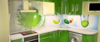
Glass skins
The leading positions in the construction market of finishing materials are occupied by glass sheets, the so-called skinals.
Made from durable, heat-resistant, shock-resistant material, they do an excellent job of their task: protecting walls from splashes and plaque, simplicity and ease of care and cleaning, beautiful appearance with various effects from transparent and mirrored to paintings, photographs and 3D images.
Tempered glass, triplex, and plexiglass are used for skinals.