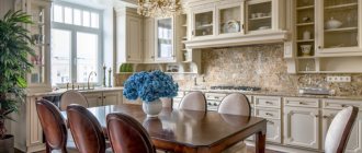
Features of combining kitchen and living room
If the room initially has a large kitchen, organizing a combined space of several functional areas is quite easy. But even in small apartments, a similar design solution can be implemented by destroying the partition between the kitchen and the adjacent room. It is important to remember that in a residential building, the demolition of any wall must be coordinated with government services.
This need is due to the safety of other residents. If the owner does not approve the redevelopment, he may be subject to a fine and the obligation to return everything to its original form. In extreme cases, the apartment will be confiscated. This is due to the fact that some walls are load-bearing, which means their demolition can lead to the tilting of a multi-story building.
In addition, demolishing a wall and combining space is prohibited in houses where there is a gas stove.
When combining a kitchen with a living room, you should understand that it is better to leave some communications as is. For example, this applies to sewers, water pipes and ventilation shafts. But with electrics, you can fantasize without limits and adjust it to your needs.
Pros and cons of combination
Of course, such a serious decision as demolishing walls and combining space is always accompanied by advantages and disadvantages. Without a doubt, the main advantage is a new perception of large space and the ability to create almost any interior.
Pros:
- additional lighting , since now there will be two windows in one room, and the wall will not block the sunlight;
- convenience for the housewife to simultaneously cook and communicate with family or friends, or simply keep an eye on small children;
- the ability to organize holidays and parties in a large room;
- savings on technology - for example, there is no longer a need to buy two TVs.
But such redevelopment also has its drawbacks. For example, residents lose some of their personal space due to the combination of rooms. If previously the room could be organized as a bedroom, then in the kitchen-living room this is difficult to imagine for two reasons.
Minuses:
- odors - even the best hood cannot quickly eliminate odors after cooking. And if the dish was successful, then it has a pleasant smell, but if it is burnt, then the curtains, upholstery and other textile elements will have to be cleaned and washed;
- noise - when working in the kitchen, not the most pleasant sounds often appear, such as the refrigerator compressor turning on, water pouring, or the hood operating. Residents come to the kitchen to rest and relax, and noise can interfere with this.
The kitchen-living room also imposes certain obligations, for example, to more carefully maintain order, because the sight of dirty dishes that can be seen from the sofa is rather unattractive. Of course, there are disadvantages to such a combination of spaces, but, nevertheless, the kitchen turns out to be spacious, cozy and suitable for creative experiments.
Advantages and disadvantages of combined space
The lack of space forces the creation of multifunctional rooms, and in many cases combining the kitchen and living room is a reasonable solution. Using the popular studio room idea offers the following benefits:
- A spacious room is created, which is much more comfortable to be in.
- New opportunities open up for stylish design and convenient zoning.
Neoclassical Source pobo.me
- Anyone who cooks does not feel isolated from the family. He can participate in general conversation, look after the children and watch TV.
- Setting the table becomes a more comfortable experience.
Classic zoning Source img.benimmulku.com
Before deciding on redevelopment, you need to take into account possible inconveniences. Combining premises with such different purposes has the following disadvantages:
- The owners are deprived of a separate room. It doesn't matter if the living room served only as a living room. If someone slept there, then now his peace will come to an end because of those who like to look into the kitchen early in the morning or late at night.
- Cooking smells. Even a closed door can’t save you from some, but in a combined space the problem becomes more pronounced. Odors are absorbed into curtains, carpets and upholstery, and are difficult to get rid of. Conclusion - you should take care of a powerful hood.
Loft style Source obustroeno.com
- Sounds. Anyone relaxing in the living room will watch an interesting program to the sound of a working refrigerator and hood. It is also difficult to get used to the sound of pouring water and operating electrical appliances (meat grinders, coffee grinders). Sharp sounds, such as those of a meat hammer, are especially annoying.
- Order. You will have to constantly maintain order in the kitchen area, which is difficult for those who like to leave dirty dishes “for later.”
Black and white interior Source i.pinimg.com
We tear down the wall
We must understand that not every wall can be demolished. All the more easy. If we are talking about a Khrushchev building made of brick, then there are no problems, since the load-bearing walls are only façade, and all internal walls can be demolished without problems.
But if the house is panel, then the situation is more difficult. Usually in such houses the wall between the living room and the kitchen is load-bearing and made of concrete. If you remove such a wall, the load will be distributed incorrectly, the building may tilt and even collapse.
The conclusion is the following: load-bearing walls cannot be demolished!
Moreover, demolishing this wall is not at all easy, unlike a brick one. Concrete can only be cut using diamond spraying - this is a very long, dusty and labor-intensive process. If you really want to demolish a load-bearing wall, you will have to install large metal fortifications in its place. And even in this case, you cannot completely get rid of the concrete - you must definitely leave a piece of it at the junction with the floor slab.
In addition, even this requires permission from government agencies, which is very difficult to obtain. You can do without it, but it will still come to light when selling an apartment or doing a major renovation. It's also unsafe.
Which wall is load-bearing?
The easiest and surest way to find out which wall is load-bearing is to look at the technical passport. There, load-bearing walls are highlighted with a thick line. If this document is lost, then you can look at the ceiling itself - the load-bearing wall always stands out. But this method can also fail, for example, if the apartment has been decorated.
Therefore, the most popular method is tapping. If there is a slight vibration and the sound is booming, you can bear it. If the wall is very hard, there are no vibrations, and the sound is dull, it is better not to experiment with it.
This rule, again, only applies to cases where there is no thick layer of finishing. If a load-bearing wall is covered with plasterboard or putty is applied poorly, vibration and a booming sound may occur.
What zones should be present in a studio kitchen?
After the wall is demolished, it turns out that 20 sq. m. - this is not at all small, and here you can even get confused. For this reason, it is advisable to think through the interior and layout before demolishing the walls. After all, there is a possibility that part of the wall can be left to place there, for example, a bar counter or to decorate an arch. There are three main zones that should be present in a kitchen-living room of 20 sq.m.
| Work area (kitchen) | Stove, sink, countertop, kitchen set |
| Dining area (dining room) | Table with chairs (armchairs, stools) |
| Recreation area (hall, living room) | Buffet with dishes, bookcase, TV, coffee table, armchairs and sofa |
It turns out that the kitchen-living room should have all the attributes that would be in two separate rooms. But if before the demolition of the wall it was possible not to pay much attention to the compatibility of these pieces of furniture, but now you cannot afford such luxury: everything must be done in the same style and harmonious color scheme.
Setting priorities
The next step in developing a 19 meter studio is to determine the purpose of each zone. People who prefer to spend a lot of time cooking and mastering new recipes should allocate more meters for the working area. In the living room you can put a small kitchen sofa, table, TV, etc. For those who do not like to cook or prefer to eat out, you can suggest making the kitchen area smaller. The effect of its absence can be achieved by placing a small kitchen unit in the far corner and matching the furniture to the color of the walls. The living room in this case can occupy the entire space. Here you can place massive soft corners, sofas, large tables, fireplaces and aquariums.
When planning a kitchen-living room, it is important to determine the area of each zone - it depends on your preferences: whether you like to cook or prefer quick snacks in front of the TV
Headset layout options
A kitchen combined with a living room, thanks to its large space, will accept almost any layout, but the following options are the most popular:
- parallel;
- letter P;
- letter G.
Each layout has its pros and cons, which must also be taken into account. In addition to the personal wishes of the owners, the design of a studio kitchen of 20 square meters also depends on the features of the room, for example, its geometric shape, the presence of a balcony or the number of doors and windows.
The main principle for arranging furniture is the working triangle. This principle requires that such important kitchen elements as the sink, stove and refrigerator be located next to each other, ideally forming a triangle.
At a minimum, there should be no obstacles between these items, such as a table or upholstered furniture. Otherwise, the housewife will waste time walking in this labyrinth while cooking.
Parallel layout
If the room has a rectangular shape, then the parallel layout seems to have been specially created for it, because there will still be enough free space in the center. With this layout, a set and similar accessories for the work area are usually placed along one wall, and upholstered furniture for guests is placed along a parallel wall. A table or island can be placed in the center to zone the room.
There is another, more familiar, option for parallel arrangement: with it, the set still remains along the wall, and the second part of the set plays the role of an island that separates the living room from the work area.
This layout is one of the most popular in kitchens and living rooms because it looks very cozy, but at the same time is very functional.
Letter P
A U-shape layout is a very convenient option, because while cooking, the housewife will only have to take a couple of steps to get to another functional area. The arrangement of such a kitchen is somewhat reminiscent of the previous layout:
- first option - there is a set along the first wall, upholstered furniture in parallel, and the dining group plays the role of a bridge between them;
- The second option is that there is a set along two adjacent walls, and the third part of it plays the role of a bar counter, and at the same time separates the recreation area from the work area.
Letter G
The L-shaped layout is often called the best because it is compact yet creates a perfect work triangle and also has plenty of storage space for kitchen utensils. This is ideal for square-shaped rooms.
For a more harmonious interior, it is better to place the furniture in the recreation area parallel to the main work area.
Selection of furniture
In a combined room, you should not arrange furniture as you please. There are certain rules and recommendations. To save free space, the elements are installed in a straight line or in the letter G. Large furniture is also not desirable. An excellent option would be hanging drawers; you can store all kitchen utensils and necessary little things in them.
Young designers often match kitchen fronts to the color of large furniture elements. All appliances are built-in, neutral shades. If the furniture is bright, the finish should be light, without patterns or designs.
It is also not recommended to clutter the recreation area; a minimal set is sufficient. The sofa is placed with its back to the kitchen, opposite the TV. There is no need for heavy curtains; they will weigh down the space; it is better to give preference to light fabrics.
Zoning methods
The kitchen-living room must be at least visually divided into independent zones. There are several ways to do this, but first you need to decide where exactly the zoning object will be located.
Designers believe that 5 square meters will be enough for a working area. m, and the rest of the space can be left as a recreation area.
When choosing a zoning method, you need to ensure that it is combined with the overall style of the room.
Bar counter
One of the most popular ways to “divide” a room into functional zones. The design itself is simple, but at the same time it has many variations in sizes, colors, finishes and styles, which makes it possible to choose a rack that really suits any interior.
Dimensions are selected individually based on the functions assigned to the future furniture. If a bar counter needs to replace a table, then, of course, you need to look towards more massive and larger options.
But we must not forget that small children and older adults may find it difficult to reach a table or climb onto a high chair.
Island
The island is somewhat reminiscent of a bar counter, only it is not connected to anything and is most often made out of cabinets. You can even build appliances or a sink into it. But in this case, it is especially important to maintain the ideal frequency, since clutter on the island can make the entire room uncomfortable and untidy.
Instead of an island, you can also use a dining group, but this option is only available for really large rooms. A kitchen-living room of 20 meters is exactly one of these.
Different levels
You can delimit space by using different levels of the floor or ceiling. The easiest way is to make the plasterboard ceiling in the dining area slightly lower than in the rest. Spotlights can be built into the drywall, which will additionally illuminate the recreation area.
The same effect can be achieved if you place the dining group on a small podium. If desired, you can add one or two steps. The optimal lifting height is from 15 to 25 centimeters.
Arch
Zoning can also be done using more elegant tools, for example, wall-ceiling structures in the form of arches. They can be:
- square;
- semicircular;
- curly.
But choosing an arch for a room is not easy. It is very important to ensure that the material, shape and size fit harmoniously into the interior of the 20-square-meter kitchen-living room.
For example, for a room in a country or Provence style, it is best to use wooden structures with built-in shelves where you can place old books or a beautiful service. For a more modern kitchen, regular plasterboard is suitable - a budget solution.
Sofa
Another common method of planning zoning. All you need to do is simply place the sofa with its back facing the work area.
But there is one drawback - it’s not very convenient to communicate with guests or family, since their backs are also turned while the hostess is cooking. But the sofa can be called a full-fledged relaxation area, so there is no need to spend money on other entertainment.
It is important to ensure that the sofa does not clutter up the entire space, making the passage inconvenient. You should also avoid very large models, since they will optically make the room smaller. It’s a great idea to find upholstery to match the kitchen unit - the room will instantly become as harmonious as possible.
If the sofa is located with its back in the work area, then you can hang a TV on the opposite wall. Such upholstered furniture has several advantages:
- additional seating area;
- additional storage space;
- creates a cozy and harmonious atmosphere;
- if desired, it can be a bright accent in the interior;
- you can easily change the overall look of the room by choosing different pillows.
A sofa is what you need for a kitchen-living room of 20 m2.
Plasterboard partition
A rare, but very effective way of zoning is a plasterboard partition. Its advantage is that you can implement any ideas - from a blank openwork wall to a purely decorative partition with a large number of niches and decor in them.
There is a more difficult choice here - between functionality and beauty.
Mobile partition
A very practical way of zoning space can be called a mobile delimiter, or simply a movable partition. Sometimes it is also called a screen. Often they are used solely for decorative purposes, but they can also serve as zoning.
The variety of materials allows you to choose a partition to suit any interior. It can be stained glass, painted silk or trendy plastic.
Color
Color is another way to divide space into functional zones, and it is very simple to use: you need to decorate different zones in different, preferably contrasting, colors.
Not only the colors may differ, but also the materials used. For example, light tiles are used for the floor of the work area, and dark wood is used for the dining area. This approach can also be called practical, since ceramics have excellent performance properties.
Such contrasts can occur in color:
- ceilings;
- walls;
- curtains;
- and even the furniture - the set is light, and the dining area is dark.
Here you can show your imagination to the maximum, but it is important to ensure that the overall picture is still harmonious.
Design of a kitchen-living room 20 sq. m: use of a bar counter
A small counter can have a decorative function and serve to divide the space into zones.
- It most often consists of a lower support part and a table top. This stand blends beautifully with the surrounding environment, does not stand out, but perfectly fulfills its function.
- The material for the bar counter is chosen based on the overall style of the room: it can be wood or plastic. The tabletop can be made matte or shiny, and the lower part can be made of brick or stone.
- Sometimes a bar counter is built above a low partition. At the bottom there may be cabinets or shelves for dishes and kitchen accessories.
The bar counter is an integral element of the Art Nouveau style. Bar stools or bar stools should be a mandatory addition.
Choosing a style
It is best to choose the style of the room based on the interior of the apartment or room as a whole. A description and photo example of each option will help you decide on the final solution.
| High tech | A modern style that uses light and cool tones. The materials often used are plaster, glass, metal and other smooth surfaces. Lighting requires spotlights and floor lamps. |
| Classic style | This interior is suitable for people who value comfort and tradition. A fireplace is installed in the sitting area, and a chic chandelier with warm light hangs above the dining table. Classic means luxury, so furniture is chosen from wood decorated with gilding or patina, and porcelain vases, beautiful and large paintings, luxurious curtains, and so on are used as decor. |
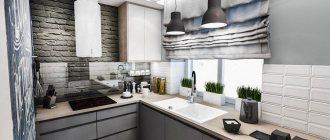
| Loft | Urban style abandons a large number of decorative elements. The main thing is functionality and practicality. In the decoration you can often find decorative bricks and blackout curtains or their complete absence. |
| Minimalism | This design direction is characterized by monochrome and laconic furniture. The room must be spacious and bright. Light is the main character of the interior, so it is very important to think through the lighting system. |
| Scandinavian style | This style advocates complete unity with nature, which affects the colors and materials used in the interior. The furniture chosen is airy and laconic, and popular colors include blue, gray, brown, and green. Deep colors are especially relevant. The presence of wood and textiles in the room is a must. |
| Country | If you want some rustic simplicity and comfort, then this is country music. The furniture is a little aged, wicker decor is used, beautiful dishes are displayed on the shelves, and a lovely cotton tablecloth lies on the table. This interior is very comfortable, it seems to take you back to childhood. |
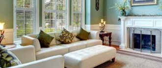
| Neoclassical | Neoclassicism is a classic style with a modern interpretation. Symmetry and orderliness are important here. The interior should be modern and look expensive. Popular colors include yellow, green, sand. |
| Provence | This is the style of the French countryside. The furniture is made of light wood. An arch can also be made from the same material. Much attention is paid to decor: these can be candlesticks, frames for photographs and posters, beautiful dishes, rugs or chair pads. Popular colors are lavender, peach, white, turquoise. |
There are many styles in which you can decorate a kitchen-living room, since due to the large space there are no restrictions. The variety of materials and furniture in stores will allow you to create the most daring image.
Stylistic design
19 sq. m cannot be called a large area, so to decorate the interior of the kitchen-living room you should not choose classical styles: baroque, classicism, rococo. A modern design is more suitable for the room.
Minimalism
Kitchen-living room 19 sq.m. m, decorated in a minimalist style, will look laconic and strict. There is no room for unnecessary details. The set should have blank facades, the sofa should have wide armrests and low legs, and plain upholstery. Strict, clear lines should be traced in every element of the interior. The main colors of minimalist design: gray, white, black and brown. You can decorate the interior with a plain carpet, several paintings or photographs in rectangular frames, and a mirror.
Provence
This French style will help fill the room with light, warmth and comfort. To design a kitchen-living room, you need to choose simple wooden furniture in pastel colors, which should have an antique look, a sofa or armchairs with floral patterns on the upholstery. The use of open shelves and glass facades is encouraged. Cabinet furniture should be white, pink, green, blue, light blue or lilac. The finishing touches of the kitchen-living room interior are light light curtains on the windows, a tablecloth and handmade napkins.
High tech
A prerequisite for this style is the presence of modern household appliances. The work area should be equipped with multifunctional household appliances, the metal facades of which should not be hidden behind cabinet doors, but rather, on the contrary, put them on display. A large flat-screen TV should decorate the living room wall. Furniture should please the eye with glass elements, the shine of chrome and gloss. Photo of the design of the kitchen-living room 19 sq. m can be seen below.
Modern
Smooth curved lines, asymmetry, designer furniture of unusual shape, floral patterns. All interior elements should be comfortable and functional. For zoning the kitchen-living room 19 sq. m you can use an arch or partition with stained glass windows. The main colors of Art Nouveau: marsh, blue, brown, smoky, white, gold, silver, olive.
Combining the kitchen and living room is a good solution for owners of small apartments. Connecting two rooms has many advantages. To create a harmonious and cozy interior, you need to choose a suitable interior style and correctly divide the room into zones. A competent choice of zoning method will allow you to create an interior in which both the inhabitants of the home and invited guests will feel comfortable.
Color selection
As you can see, some styles themselves dictate the preferred color palette. However, this color scheme is very important because it can highlight the overall design of the kitchen.
Harmony in the kitchen is the most important thing, so it is better to use no more than three different colors in the interior: more color spots will visually fragment the room, making it uncomfortable.
It is also important to consider the location of the window. If it faces north, it is customary to stick to warm colors to smooth out this effect. Beige and peach tones are suitable.
If the windows face south, the kitchen will need a breath of freshness, which can be provided by bluish tones like turquoise, mint, light gray and others.
White
White tones will make a kitchen-living room of 20 square meters. m. even more spacious. Minimalism, country or Provence will fit perfectly in such an interior. If you add some bright accents, white will become an excellent background. Such accents can be brown furniture or contrasting bright decor. This solution is perfect for people who love practicality and comfort, while respecting tradition.
Yellow
For example, you can use bright yellow parts. They will look good in the form of textiles - for example, curtains, tablecloths or napkins. If the owners are bold enough to use yellow in decoration, then the furniture is selected either very light or light green. Such an interior must be diluted with fresh flowers.
Yellow not only refreshes the space, but makes it lighter and airier. But in this case, the main thing is not to overdo it.
Green
Mint tones have been on trend since 2021, and this fashion will not leave us soon. These colors look great combined with:
- white;
- peach;
- brown;
- sandy
It's a good idea to complement the green tones with accessories reminiscent of nature. For example, wicker or wooden figurines, pottery or photo wallpaper of a similar theme. This will create a fresh atmosphere of a forest house in a matter of seconds.
Grey
Gray color is also very popular in kitchens. It goes well with yellow and blue. At the same time, it is universal - it can be used both as accents and as decoration. Deep gray color will look great in a classic or, conversely, modern interior.
Red
If you want more emotions, you can add bright colors, for example, red. If you want a more delicate and calm design, you should take a closer look at crimson and burgundy tones in furniture and decor, and leave the finishing light.
In bright interiors, it is necessary to think carefully about light, since without a sufficient amount of it, the kitchen-dining room will seem gloomy.
Decor, textiles and accessories
The choice of decorative elements and textiles in the design is determined by the general style of the room. The main thing is not to forget that everything should be in moderation; there is no need to overload the space with a lot of kitchen utensils and decorative accessories.
The choice of curtain style is influenced by the style direction of the interior, and the selection of fabric is influenced by the degree of illumination of the room.
Modern interior design styles require a minimum number of decorative elements, selected with taste.
By choosing these design styles, you will create a very cozy and comfortable atmosphere in your home.
Finishing materials
The style of the room also affects the choice of materials. For example, classic prefers wood, and high-tech prefers glossy glass and metal surfaces.
But we need to consider its practicality, because the kitchen is a room with a very complex atmosphere.
Floor
In the recreation area of the kitchen-living room, it is better to use a plain floor covering. It can be parquet or laminate. The original carpet is usually placed next to the sofa.
A selection of photos of kitchen-living rooms 19 m in the interior
Speaking about the design variations of a small and multifunctional room, it is still difficult to imagine all possible combinations of color, shape and style. Therefore, designers always offer to study a lot of photographs that will help you find exactly “your” project. Of course, each of them has special features, so you will have to add your own individuality to any interior. The current trend today is to arrange a living room and a hobby area. Such corners fully reflect the lifestyle and hobbies of the owners. They are the ones who make even cold high-tech cozy and unique.
Lighting
There are several tips that will help you avoid mistakes with lighting in a kitchen-living room of 20 sq.m:
- if the room seems too strict, then pendant lamps can be placed above the dining area;
- to save electricity and help nature, you should set up separate lighting - that is, the lamps in the work area work separately from the dining or living room;
- For the relaxation area, soft lighting will be enough, but for the work area it needs bright lighting;
- if you want to amaze all your friends and add some color to your life, you can make LED lighting with color control;
- It is better to choose matte lampshades so that the light is not too bright and does not dazzle.
Rectangular kitchen
For a rectangular kitchen-living room with an area of about 20 sq.m. An island or U-shaped layout is perfect. In the latter option, one of the sides can be replaced with a bar counter, which will be an excellent transition to the recreation area.
At the same time, the island layout will give more room for imagination. For example, in this case, you can move the sink or stove to the island - this will make it even more convenient to communicate with residents or guests while cooking. But you need to be prepared for the fact that this will require pipes or electricity.
If you want to leave the maximum amount of free space, then a corner layout will come in handy. A sink is built into the corner, and below and above it are cabinets with ample storage space.
If the rectangular kitchen seems too narrow after arranging the furniture, there are several options to fix it:
- Mirrors continue the interior, so the room visually appears larger. The greatest effect is achieved by tall specimens up to the ceiling or mirrors placed opposite each other.
- Photo wallpaper - high-quality photo wallpaper with perspective creates the illusion of depth, so again the room appears larger.
- Glossy surfaces - this primarily applies to facades, but other objects can also be used, for example, a table or a kettle.
- Light colors - the ability of light colors to expand space is no longer even discussed, it is an axiom.
If there are children, preference is often given to a sliding or movable partition. If necessary, adults can “close themselves” and talk while the younger generation watches TV or plays.
Where to put the refrigerator
When installing a refrigerator, you should consider the following features:
- You need to pay attention to the parameters and characteristics of the product, the shape of the room and the height of the ceiling.
- It is forbidden to place equipment near the stove to prevent it from overheating and becoming dirty.
- It is necessary to ensure a level floor under the refrigerator, as vibrations have a detrimental effect on equipment.
- It is worth considering the location of sockets.
- It is recommended to place the sink, stove, hood, storage system and refrigerator so that a work triangle is formed.
Refrigerator installation options:
- In a square or rectangular kitchen, it is worth installing the device in the corner, which allows you to save space in the room.
- The harmonious fit of the refrigerator into the niche is encouraged. Thanks to this manipulation, the equipment is less exposed to mechanical stress, pollution and exposure to the sun.
- A real way to save space is to integrate the device into a headset.
- Small refrigerators or freezers can be installed in lower cabinets under the countertop.
- A free-standing device is a classic solution for most interiors.
- If you place the equipment near the entrance, it can serve as an additional partition that zones the space.
- The refrigerator can be placed near the sink, maintaining a distance between them. This saves time in the process of washing food.
- The unit can be installed in the middle of the set, but such an installation often violates the aesthetics and obscures the furniture area.
- One common option is to place the refrigerator on the opposite side of the kitchen.
Only by properly arranging the kitchen-living room will you be able to create a comfortable area for preparing food, as well as for relaxing and eating.
Square kitchen
For a square kitchen, the best layout is a corner or U-shaped one. It is these options that will leave the center of the room free, where you can lay a soft carpet or even fit a dining group.
It is worth noting that the U-shaped layout of a square kitchen does not imply the presence of a balcony. But such a room allows you to experiment even with an island.
It’s better to make it square or even round - then its location becomes much more functional. The main thing is to make sure that there is at least a meter from the island to the headset. Another tip to keep your interior from looking cluttered is to use light colors.
Renovation and design tips
Only a competent approach will guarantee that the future premises will be comfortable and cozy. Combining two rooms always requires a special approach and adherence to certain design rules. If these rules are not followed, the perception of the interior will be disrupted, most often not for the better.
Before making a final decision, it is better to read the advice from designers and builders .
- Planning approval. And we are talking not only about government authorities (which is very important), but also about all residents of the apartment. Perhaps someone is a very light sleeper, and a demolished partition will significantly increase the noise level. It won’t hurt to find out the opinion of your neighbors, if you have any.
- Choosing a single style. Even though one large room unites many functional areas, it is still necessary to adhere to one interior concept. It is better to choose discreet interiors, since the abundant decor of styles such as Rococo, Art Deco, Baroque, along with large spaces, will make the kitchen more like a museum, and this will have a bad effect on the comfort of the room. It is better to opt for a classic, Scandinavian or ethnic style.
- Zoning of the premises. If you don’t think about dividing the kitchen-living room into functional zones, then it simply won’t be cozy. This can be done both by optical and physical means. There are many options - everyone will find something that fits perfectly into the interior.
- Choice of colors. Some designers even in such a large kitchen-living room of 20 sq.m. It is not recommended to use dark colors. This is due to the fact that the room is already too saturated in its functions and furniture, which visually reduces the space. It is for this reason that it is better to look towards light and neutral colors, for example, beige, blue, yellow, pink. At the same time, it is important to observe the principle of unity of the room - in different zones the tones should be repeated or at least combined with each other.
- Installation of the hood. The kitchen-living room is a spacious room through which odors will quickly spread. Therefore, installing a hood here is not a question, but simply a necessity. If the equipment cannot cope with a large room of 20 square meters, then you can additionally install an air conditioner or a water filter for the air.
- Correct lighting. To make cooking and evening meals comfortable, you should think about good lighting and the number of light sources. Ideally, each functional area has its own separate light sources. When planning your lighting scheme, it is important to consider future partitions, as they can trap and reflect light, changing the overall appearance of the room.
- Use light colors. This will visually expand the small kitchen-living room.
We prepare documents
From the last century, we inherited apartment layouts with tiny kitchens and a large number of rooms, useless due to a lack of space. The most reasonable solution is to connect the kitchen and living room, resulting in a multifunctional spacious room. Such redevelopment often requires the transfer of communications and heating systems. Under no circumstances should you do this yourself. It is necessary to obtain permission from the relevant authorities or seek help from construction companies that provide such services.
When demolishing partitions, there is no way to do it without approval from the relevant authorities; you will also have to order a design for the future combined premises
Layout ideas
Let's look at the drawing plans for several options on how you can furnish and arrange the same room, based on different lifestyles and interests.
Option 1. Classic.
The center of this interior was the dining group. On one side there is a work area with all the equipment, on the other there is a corner sofa. Additionally, zoning occurs using the console. A bookcase and electric fireplace add coziness to the space.
The balcony door is dismantled, and on the balcony itself another small area is created where you can have a snack, drink coffee or even work. Cabinets on the balcony will create a lot of storage space, because in the kitchen there is not much space left for this.
Option 2. For cooks.
If there is a need for a larger work area, then you can consider this layout option. In this case, the kitchen set grew and became U-shaped. Because of this, the dining group also moved, which in turn moved the sofa. The sofa is no longer a corner one, but it is worth noting the presence of a carpet - it serves as a zoning function here.
The door to the balcony is being demolished again, but this time it’s better to leave the wall under the window and extend the tabletop there - you’ll get an excellent work area. Or you can use it as a bar counter. On the balcony itself there is again a work area and a closet for storing rarely used utensils.
Option 3. Clear zoning
If it is important to separate the kitchen-living room from the rest of the room, then you can make a partition, as in the drawing above. In this case, there is a spacious storage system in the hall. The interior again features a corner sofa, from which it will be very comfortable to watch TV placed on the new wall.
The dining area is represented by an island with armchairs. The work area is very large, the refrigerator is located on the balcony. If there is no need for such a large work area, then the refrigerator can be returned. An additional seating area with armchairs and a coffee table is located on the balcony.
Option 4. Original.
If you want to create a kitchen-living room that is unlike any other, then you need to take drastic measures. For example, place an island in the center of the room, which will also serve as a work area and dining table. The stove and sink are also placed here. It is worth noting that this is a rather dangerous neighborhood that is best avoided.
There is a carpet on the floor again, which separates the work area from the living room. A large cabinet took the usual place of the kitchen unit. And the refrigerator is again moved to the balcony. All necessary additional equipment is transferred there.
This option cannot be called convenient and practical if cooking occurs daily. Rather, this layout is suitable for a country house.
How to place a sofa in a room of 20 square meters. m
Regardless of the shape of the room, you can install a sofa. This element should be placed with its side or back facing the kitchen. The most popular option is to place the product in the center of the room. It is recommended to complement the walk-through space near the sofa with a table, chandelier, or floor lamp. Most often, a bar counter or dining table is installed behind the back of the sofa outside the living room.
If you have several windows, you can place a sofa near one of them, and the second window should be used for the work area. A dining table or bar counter is ideal for separating functional areas.
It is recommended to install upholstered furniture away from the stove to protect the upholstery from accidental fires and rapid contamination.
Photos of real design projects
Sometimes it can be difficult to imagine the interior of a room with any special features. The real photos below of different kitchen-living rooms with an area of 20 square meters will help spark your imagination and come up with something even better.
Square kitchen-living room.
Rectangular kitchen-living room.
In different styles.
Original solutions.
You can see a lot of original ideas in the video.
